One of the questions I get asked a lot is, how do I turn off my scrolling animations on mobile? Use ScrollTrigger.matchMedia is my answer.
Before ScrollTrigger’s matchMedia you might have used enquire.js or vanilla JavaScript matchMedia to handle responsive animations.
You have to control when the scrolling animations are created, when they are destroyed and recreated again.
In this tutorial, you will learn how to use ScrollTrigger’s matchMedia to handle all that with just a few lines for code.
Our Scenario – Responsive CSS and HTML
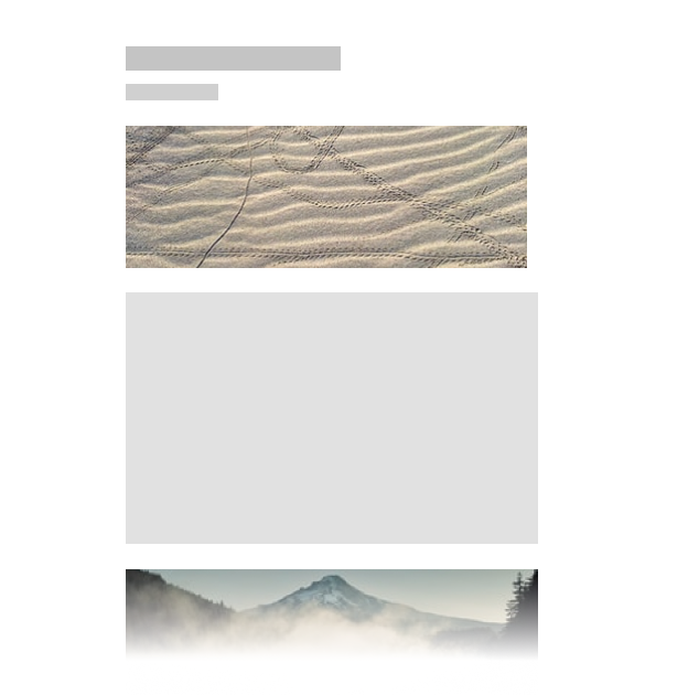
For this demonstration lets assume that we have a simple layout with 3 sections.

On mobile we want to have everything scrolling naturally with no scrolling animations.

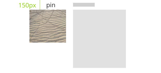
On desktop we want the image to be on the left next to the text.
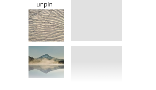
We want to pin the image during scrolling and unpin it when the next section comes into the view.
.wrapper {
  ...,
  img {
    max-width: 100%;
  }
}
@media (min-width:1025px) {
  ...,
  section img {
    position: absolute;
    left: -450px;
  }
}
Inside of the large breakpoint we are changing the image to be absolute positioned instead of the default position relative.
Setup ScrollTrigger pin

Now lets setup the ScrollTrigger that will pin the image and unpin it when we scroll down the amount of pixels matching the height of our section.

const sections = document.querySelectorAll('section');

sections.forEach(section => {
  const img = section.querySelector('img');
  ScrollTrigger.create({
    trigger: img,
    start: 'top top+=150',
    pin: true
  })
})
I have kept this ScrollTrigger intentionally very simple, you can read more about the ScrollTrigger basics in the previous tutorials or signup to the free online course GreenSock 101.
We are pinning the image when the top of it is 150px from the top of the viewport.
This ScrollTrigger is inside of forEach to trigger each section individually.
It works great but if you resize the window to a smaller breakpoint the same “animation” would happen and that is not what we want.
Setup ScrollTrigger matchMedia
Luckily we can use ScrollTrigger.matchMedia, specify the correct breakpoint and our animation would only be triggered at the correct screen size.
Here is the syntax:
ScrollTrigger.matchMedia({

    "(min-width:1025px)": function() {
        // these triggers will only happen at the right screen size
    },

    "all": function() {
        // these triggers will work all the time
    }

})
Any ScrollTriggers created inside of a breakpoint will be triggered only when the browser viewport size matches and the animation will be automatically destroyed outside of this breakpoint.
Any ScrollTriggers created in the “all” function will be triggered in all breakpoints.
How handy is that? All we have to do for our example is to paste our code inside of the breakpoint.
ScrollTrigger.matchMedia({

    "(min-width:1025px)": function() {
        sections.forEach(section => {
            const img = section.querySelector('img');
            ScrollTrigger.create({
                trigger: img,
                start: 'top top+=150',
                pin: true
            })
        })
    }

})
Now the pinning of our images will only happen on desktop, and everything will be unpinned on mobile devices.
Final Demo
Open this demo in a new tab and resize the browser window to see ScrollTrigger matchMedia in action.
4864
Conclusion
Now that you have learned how to use ScrollTrigger.matchMedia you can easily create a different GreenSock animations for different breakpoints.
How are you managing your responsive animations? Let me know in the comments.
Looking for more advanced GreenSock and ScrollTrigger tutorials? Check out Bella or Practical GreenSock.

