Category Archives: Snippets

How to speed up your front-end development workflow with Hygen.io

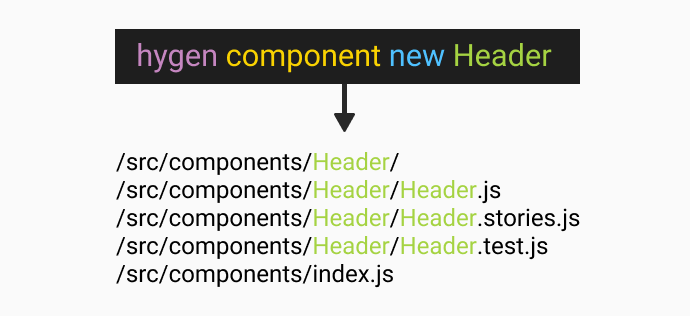
I work on a lot of Next.js and React projects, and especially in the initial phase of each project, I have to create a lot of files for each component.

Your typical React project could include Styled Components for CSS, Storybook for a design system, and Jest for tests.

If you want to create a new Header component, you have to manually create a folder /src/components/Header and then the following files:

  • create a component file – Header.js
  • create a stylesheet – Header.styles.js
  • create a storybook story – Header.stories.js
  • create a test file – Header.test.js

Then inside of each file you probably use some React code snippets for VSCode to quickly create a functional component or the necessary content for each file.

In this article, I will show you how you can speed up this process with Hygen.io.

If you want to save some time and speed up your front-end development workflow, keep reading.

This guide is useful for any framework or programming language and is not React or Next.js specific.

Are you new to React? Learn React from scratch in React 101.

Duplicate components

Duplicating components is another way how to quickly create all of these files, but quite often involves:

  • deleting previous code inside of each file
  • fixing import statements (VSCode helps with that)
  • other clean up

And your app might be temporarily broken until you tidy everything up.

What we want is to run one command to generate all files and their content too!

What is Hygen?

Hygen is a scalable code generator that saves you time, simple as that.

Once you set it up, you will be able to:

  • generate multiple files
  • generate the content of each file based on a template
  • inject any code inside of any file

The injecting part is useful if you are using index files (barel) to simplify your import statements.

We will install Hygen to do all of this for us.

How to install Hygen?

You can install Hygen globally or use npx to execute it without installing it.

// install hygen
npm i -g hygen
npx hygen ...

Firstly initiate Hygen in your current project directory.

// initiate hygen
hygen init self

This adds _templates folder in the root of your project with a generator inside of it.

Now we can create our generator and call it component.

// create new generator
hygen generator new component

To run the component generator is simple:

// run custom generator
hygen component new

This would try to generate files based on all templates in the /_templates/component/new folder.

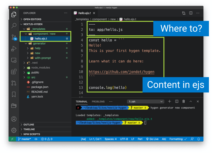
If we run this new component generator, Hygen would create a new file in /app/hello.js, with the hello constant and console log inside of it.

Custom templates for new React component

Modify it to create a new Header component.

You can modify the filename from hello.ejs.t to index.ejs.t, it does not really matter.

And change the content of the template to this:

---
to: src/components/<%= name %>/<%= name %>.js
---
import React from 'react'

export const <%= name %> = ({ children }) => (
  <div className="<%= h.changeCase.paramCase(name) %>">{children}</div>
)

Of course, you can include any React component snippet that you wish.

This template that would generate Header.js like this:

// /src/components/Header/Header.js
import React from 'react'

export const Header = ({ children }) => (
  <div className="header">{children}</div>
)

The top part of the template includes metadata. Here is a list of all the Frontmatter properties, such as where to create the new file.

The bottom part contains the body of the template using EJS.

Whatever your naming convention is, run the generator to create the files with the correct name, eg. header or Header.

// generate new Header component
hygen component new Header

// run in a test mode
hygen component new Header --dry

// Header is the name variable inside of the template
<%= name %>

Do you see how everything is transformed based on the name (Header) of the component? That is the beauty of setting up these templates based on your project.

It is great to dynamically generate one file, but by generating multiple files you are really speeding up your front-end development workflow.

Generate multiple files

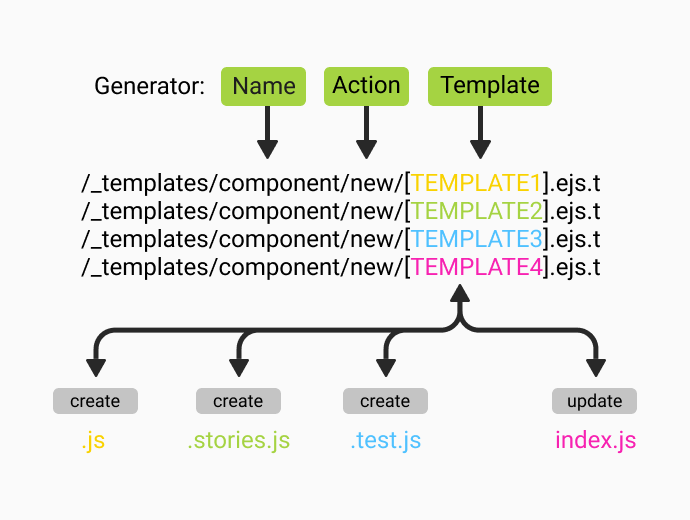
Depending on the configuration of your project, you might need to create multiple other files, not just the component folder and the js file.

For each file that you need to generate, include a new template file in _templates/component/new and name it whatever you like.

Here is an example of styled components.

// /_templates/component/new/styles.ejs.t
---
to: src/components/<%= name %>/<%= name %>.styles.js
---
import styled from 'styled-components'

export const <%= name %>Wrapper = styled.div`
    
`

Here is an example of a story for storybook.

// /_templates/component/new/story.ejs.t
---
to: src/components/<%= name %>/<%= name %>.stories.tsx
---
import React from 'react';
import { Meta, Story } from "@storybook/react/types-6-0";
import <%= name %>, { <%= name %>Props } from './<%= name %>';

export default {
    title: 'Components/<%= name %>',
    component: <%= name %>,
} as Meta;

const Template: Story<<%= name %>Props> = (args) => <<%= name %> {...args} />;

export const Primary = Template.bind({});
Primary.args = {};

Hygen will take all the templates in the /new folder, and generate the related files.

Pretty cool, huh?

Inject export into index.js

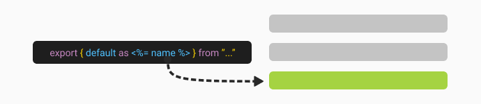
It is useful to create index.js in the components folder to simplify your import statements.

Here is how you can use Hygen to inject a line into it:

---
inject: true
to: src/components/index.js
skip_if: components/<%= name %>
append: true
---
export { default as <%= name %> } from "./<%= name %>/<%= name %>";

inject will add the content of the template to the specified file, and it will skip if the component is already there.

You can choose whether to append or prepend the new content.

Refer to the full documentation on injection to fully customise Hygen to your needs.

Variables and Helper functions

Sometimes you need to transform the name of the component to uppercase, lowercase, camelCase, and for that, there is a lot of helper functions that you can use.

Refer to the official documentation for Hygen.io.

The benefits

Apart from speeding up your front-end development workflow, you can also include these templates in the project source code for other team members to use.

  • everyone saves time
  • consistent project structure
  • easier onboarding

Conclusion

Setting up Hygen.io does not take more than 5 to 10 minutes and can save you valuable time in the long run.

How do you generate new files on your React or Next.js project?

Let me know in the comments. I am curious.

Barba.js - Namespace, Rules and Conditions

Barba.js – Namespace, Rules, and Conditions

In the previous tutorial, we’ve covered how to create some cool page transitions using Barba.js and the CSS plugin. Today we will break down some the of terms associated with Barbas page transitions logic.

This will help you to trigger the right transition at the right time.

Barba.js Tutorial

What you will learn:

View Demo →Download Files ↓

What is a namespace?

Barba.js namespace

In simple terms, a namespace is the name of the page that you are leaving or entering.

It is defined on the data-barba="container".

<div class="wrapper" data-barba="container" data-barba-namespace="home">
    ...
</div>

This namespace is very useful if you want to define some rules for your page transitions.

When defining a transition in barba.init({...}) you can tell Barba to use this transition only if some conditions are met. More on conditions later.

There are many custom page transitions in the top award-winning websites.

The developers carefully consider which elements need to be animated out before the new page is animated.

In the CSS page transitions example, I have defined a different namespace for each page to be able to trigger different page transitions.

barba.init({
  transitions: [
    {
      name: 'home',
      to: { namespace: ['home'] },
      leave() {},
      enter() {},
    }, {
      name: 'fade',
      to: { namespace: ['fade'] },
      leave() {},
      enter() {},
    }
  ],
});

If we click on a link that takes us to fade.html, we play the fade transition. If we go to the index.html, the home transition will be used.

That’s how we have used namespace in the transition rule.

How to set rules for transitions?

Barba.js rules for transitions

To define the rules we can specify to, from, or both keywords.

The transition with both keywords will always take a priority, followed by to and from.

namespace is not the only condition that you can use.

To make the rules even more flexible you can also define custom or route if you are using Barba Router.

Think about rules as if this is true, use this transition.

{
    name: 'home',
    to: { namespace: ['home'] },
    leave() {},
    enter() {},
}, {
    name: 'clip',
    // to: { namespace: ['home'] }, // this would make it stronger
    from: { namespace: ['with-cover'] },
    leave() {},
    enter() {},
}

Above are two transitions, one with the rule “to home”, the other one with “from with-cover” namespace.

What if the user goes from with-cover to home? Which one would be used?

The home because to is stronger than from.

If we would add to: { namespace: ['home'] } to the clip transition it would become stronger and would be used instead.

How to use a custom condition for your transition?

Barba.js conditions for transitions

Let’s say you have a special link on a page and you want it to trigger a special transition.

At the same time, you want any other link on that page to trigger a default transition.

You can use the custom condition like this:

{
    name: 'default',
    sync: true,
    from: { namespace: ['home'] },
    leave() {},
    enter() {},
},
{
    name: 'special',
    sync: true,
    from: {
        custom: ({trigger}) => {
            return trigger.text === 'Clip-Path Transition';
        },
        namespace: ['home']
    },
    leave() {},
    enter() {},
}

Any link on the home page would trigger a default transition, but clicking on Clip-Path Transition would trigger the special transition.

Do you see how powerful the rules are? That is how you can craft your page transitions based on many conditions.

custom is the strongest out of all conditions followed by route and namespace.

Barba applies a transition if all conditions are fulfilled.

For more details on the priorities of Barba.js transitions refer to the official documentation.

Do you want to learn even more about Barba.js? Join me in Barba 101 where we will cover Barba API in more detail. I hope to see you there.

Final Demo

View Demo Download Files

Conclusion

Mastering transition rules and knowing exactly which transition will be trigger when is the key.

Now you know how to use a namespace, set some rules, and use custom conditions for your page transitions.

I can’t wait to see how you will use it on your project.

Do you have any questions related to Barba.js or page transitions? Let me know in the comments.

Barba.js and CSS Plugin Tutorial

Page Transitions Tutorial – Barba.js with CSS Plugin

Do you want to add page transitions to your project but don’t feel comfortable with JavaScript or GreenSock animations?

In this page transitions tutorial, you will learn how to use Barba.js with the CSS plugin to create page transitions purely with CSS.

What you will learn:

View Demo Download Files

Installation

Include @barba/core, @barba/css plugin in your JavaScript module, and tell Barba to use the CSS plugin.

// install via npm or yarn
npm install @barba/core @barba/css
yarn add @barba/core @barba/css
// Include Barba and Barba CSS in your project
import barba from '@barba/core';
import barbaCss from '@barba/css';

// Tell Barba to use the CSS plugin
barba.use(barbaCss);

// Initiate Barba
barba.init();
<body data-barba="wrapper">
    <!-- content that stays the same on all pages - eg. header -->
    <div data-barba="container">
        <!-- content that will change from page to page -->
    </div>
    <!-- content that stays the same on all pages - eg. footer -->
</div>

Barba.js will now add and remove specific CSS classes from the data-barba="container".

These CSS classes will be based on the transitions that we need to specify.

If you are completely new to Barba.js, you can check this tutorial to learn more about the required HTML markup.

How to create fade-in transition on page load

Barba.js CSS Page Transition

To create a simple fade in transition on page load we can use the once hook.

barba.init({
	transitions: [
        {
            once() {}
        }
    ]
});

Barba.js will add and remove the following CSS classes .barba-once, .barba-once-active and .barba-once-to during the transition.

/* Page load animation */
.barba-once {
    opacity: 0;
}
.barba-once-active {
    transition: all 1s linear;
}
.barba-once-to {
    opacity: 1;
}

.barba-once and .barba-once-active will be applied at the start of the transition.

.barba-once-active and .barba-once-to will be applied during the transition.

This hook is called once, because this transition only runs once on the page load.

When the CSS transition is completed, all CSS classes will be removed from the container.

Barba CSS with once hook

How long these classes stay on the container depends on the duration of the CSS transition or animation.

Because the CSS plugin overrides the main once hook, any code inside of once will be ignored. The same applies to the enter and leave hooks.

barba.init({
	transitions: [
        {
            once() {
                console.log('this will be ignored');
            },
            beforeOnce() {
                console.log('shows up BEFORE once transition');
            },
            afterOnce() {
                console.log('shows up AFTER once transition');
            }
        }
    ]
});

If you need to run any code related to the once transition use beforeOnce or afterOnce hooks.

How to customize the name of the CSS class?

You can customize the CSS classes by specifying a name for your transition.

transitions: [
    {
        name: "home",
        once() {}
    }
]

If you specify home as the name, Barba will generate these classes:

.home-once
.home-once-active
.home-once-to

The format of the class is always the same: .[name]-[hook]-[state].

How to create CSS transition between two pages

Barba.js CSS Page Transition

Every page transition has two phases.

Firstly the current page leaves, then the next page enters.

To use CSS transitions between two pages, we need to specify the hooks inside of the Barba transition, even if there is no code inside of them.

transitions: [
    {
        name: "fade",
        leave() {},
        enter() {}
    }
]

Now we can add the CSS transitions to the stylesheet.

/* =Fade out, fade in */
/* Fade out current container */
.fade-leave {
    opacity: 1;
}
.fade-leave-active {
    transition: opacity 0.3s linear;
}
.fade-leave-to {
    opacity: 0;
}

/* Fade in the next container */
.fade-enter {
    opacity: 0;
}
.fade-enter-active {
    transition: opacity 0.3s linear;
}
.fade-enter-to {
    opacity: 1;
}

1. Fade out the current page

Barba CSS with leave hook

In the first phase of the transition, we are fading out the current page.

.fade-leave /* start of the transition */
.fade-leave-active /* CSS transition */
.fade-leave-to /* end of the transition */

The state of our container is opacity: 1 at the start of the transition and opacity: 0 at the end of the transition.

.fade-enter-active class defines the CSS transition that will be used, eg. opacity 0.3s linear.

2. Fade in the next page

Barba CSS with enter hook

In the second phase of the transition, we are fading in the next page.

.fade-enter /* start of the transition */
.fade-enter-active /* CSS transition */
.fade-enter-to /* end of the transition */

We are starting from opacity: 0 and finishing with the page fully visible at opacity: 1.

Of course, you can combine the CSS selectors if the styles are the same.

/* =Fade out, fade in */
/* Fade out current container */
.fade-leave,
.fade-enter-to {
    opacity: 1;
}
.fade-leave-active,
.fade-enter-active {
    transition: opacity 0.3s linear;
}
.fade-leave-to,
.fade-enter {
    opacity: 0;
}

Perfect, this was a simple fade transition, but what if wanted to make a transition where both containers are visible on the page? How would we do that with Barba.js?

Let’s see in the next example.

How to create clip-path transition

Clip-path page transition using Barba.js

Now that you know the basics of Barba.js and the CSS plugin, only your imagination is your limit!

In the next example, we will try to reveal the next page from the center of the screen.

We will clip the incoming page clip-path: circle(0%); at the start and reveal it by specifying clip-path: circle(75%); as the end of the transition.

For this effect, we need to have both containers on the page and Barba has a sync mode build-in exactly for that.

transitions: [
    {
        name: "clip",
        sync: true,
        leave() {},
        enter() {}
    }
]

This will append the next container to the page and we will have both containers available for the transition.

Without the sync mode, the current page is removed from the DOM just before the next page is appended.

/* =Clip-path transition */
.clip-enter { 
    clip-path: circle(0%); 
}
.clip-enter-active {
    position: absolute;
    top: 0;
    z-index: 2;
}
.clip-leave-active,
.clip-enter-active {
    transition: all 0.75s var(--easing);
}
.clip-enter-to { 
    clip-path: circle(75%); 
}
.clip-leave { 
    opacity: 1; 
}
.clip-leave-to { 
    opacity: 0; 
}

With both containers on the page, we are overlapping them by positioning the incoming page on top of the current page.

Then we are animating the clip-path from 0% to 75%.

At the end of the transition, the current page is removed from the DOM and the next is the new current.

Makes sense? I hope it does.

It is quite fun to play with these transitions. Agree?

Let me know in the comments.

How to create a cover transition

Cover page transition using Barba.js

In this example, we will look at how to cover the current page and reveal the next page.

For this effect, we will need to include .transition element inside of each page.

<div data-barba="container">
    <div class="transition">
        <h2>Cover Screen</h2>
    </div>
</div>

This is a simple full-screen element covering the whole viewport, by default it is positioned outside of the viewport using transform: translateY(-100%);.

/* =Transition with cover screen */
.with-cover-leave,
.with-cover-enter,
.with-cover-leave-active .transition,
.with-cover-enter-active .transition {
    transition: transform 0.5s var(--easing);
}
.with-cover-leave .transition {
    transform: translateY(-100%);
}
.with-cover-leave-to .transition,
.with-cover-enter .transition {
    transform: translateY(0);
}
.with-cover-enter-to .transition {
    transform: translateY(100%);
}

In the first phase, we are transitioning the .transition element to translateY(0) using the .with-cover-leave-to .transition selector. This is also the starting position for the enter animation.

Then we are moving the .transition out of the viewport to transform: translateY(100%); using the .with-cover-enter-to .transition selector.

As you can see, the stylesheet could grow quite quickly.

Especially if you want to animate multiple elements in a sequence, that is where JavaScript animations with GreenSock come very handy.

How to create a slide transition

Slide page transition using Barba.js

Now that you know what sync: true does, you can come up with any transition that needs both containers.

One of these transitions could be a slide transition.

.slide-leave,
.slide-enter-to {
    transform: translateX(0);
}
.slide-leave-active,
.slide-enter-active {
    transition: all 0.7s cubic-bezier(0.5, 0.7, 0.4, 1);
}
.slide-leave-to {
    transform: translateX(100%);
}

.slide-enter {
    transform: translateX(-100%);
}
.slide-enter-to {
    position: absolute;
    top: 0;
    left: 0;
}

At the start of the transition, we are using .slide-enter CSS class to position the incoming next page outside of the viewport.

Then we are animating both containers by 100%. The current page goes away from the viewport to translateX(100%) and the next page moves to translateX(0).

The page entering the viewport is positioned absolute during the transition as we have defined in the .slide-enter-to CSS class.

And that is it, now you have learned how to create 4 different page transitions using Barba.js and the CSS Plugin.

Final Demo

View Demo Download Files

Things to remember

  • You need to add an empty hook to your JS, to use CSS transition for that hook!
  • The JavaScript code in once, enter, leave hooks will be ignored!
  • beforeOnce, afterOnce, beforeEnter, afterEnter, beforeLeave, afterLeave can be used.
  • Currently, there is a bug with the back button not triggering the transition.

Conclusion

As you can see from the above examples, you can create some interesting page transitions using CSS transitions.

You have learned how Barba.js and the CSS plugin works and which CSS classes are applied to your container during the page transition.

Have you seen any cool page transitions on the web?

Let me know in the comments and don’t forget to check out some of my online courses to learn even more about creative front-end development.

Next.js Google Spreadsheets

Failing Build of Next.js and Google Spreadsheets

Are you trying to connect Google Sheets with your Next.js app?

I have come across an issue with failing builds when deploying to Vercel and to save you hours of debugging, here is what worked for me.

The Issue

All I wanted to do is to load data from Google Spreadsheet and display them in my React component. I am using Next.js and google-spreadsheets package.

In next.config.js I am setting up the environmental variables to be able to connect to the Spreadsheet when the page is served .

module.exports = (phase) => {
    ...
    const env = {
        ...
        private_key: (() => {
            if (isDev) return process.env.private_key
            if (isProd) return process.env.private_key
            if (isStaging) return process.env.private_key
            return 'private_key:not (isDev,isProd &amp;&amp; !isStaging,isProd &amp;&amp; isStaging)'
        })(),
        ...
    }
    ...
}

This worked fine locally but the build was failing when it was deployed to Vercel.

Error: error:0909006C:PEM routines:get_name:no start line

Here is the screenshot of the log.

Next.js + Google Sheets build error

After hours of debugging, calling for help and swearing at it, I had a look at how gatsby-source-google-spreadsheets works and there was the answer.

The Fix

To fix the issue I had to add .replace(/(\\r)|(\\n)/g, '\n') after the private_key.

if (isDev) return process.env.private_key.replace(/(\\r)|(\\n)/g, '\n')
if (isProd) return process.env.private_key.replace(/(\\r)|(\\n)/g, '\n')
if (isStaging) return process.env.private_key.replace(/(\\r)|(\\n)/g, '\n')

Happy times.

I am sure someone smarter than me can explain in the comments what exactly this regex does, I just know that it replaces \n with real line breaks.

React and GreenSock Tutorial

React and Greensock Tutorial for Beginners

This React and Greensock Tutorial is focusing mainly on the basics of targeting elements and using React Hooks with GreenSock.

If you have been following my blog and YouTube channel for a while, you know that I enjoy using React and GreenSock.

They are both very powerful libraries with elegant APIs.

As more and more websites are build using React, it’s important to know how to use GreenSock in the React world.

What will you learn:

Baby steps I know, but lets learn how to walk before you try to run.

If you prefer learning by watching videos, checkout React + GreenSock 101.

View Demo →Download Files ↓

1. How to include GSAP in your React Project

React and Greensock Tutorial for Beginners

I am assuming you already know how to spin up a brand new React project using the Create React App.

npx create-react-app gsap-app
cd gsap-app

Now we can install GreenSock through npm and start the app.

npm i gsap
npm start

Cool, GSAP is installed lets import it to our App component.

import React from 'react';
import { gsap } from "gsap";

const App = () => {
    ...
    return (
        <div className="App">
            <header className="App-header">
                <img src={logo} className="App-logo" alt="logo" />
            </header>
        </div>
    )
}

2. How to target elements using refs

Firstly we need to get access to the element that we want to animate.

We can use useRef because our App component is a functional component.

import React, { useRef } from 'react';
import { gsap } from "gsap";

const App = () => {
    
    const headerRef = useRef(null);

    ...
    return (
        <div className="App">
            <header ref={headerRef} className="App-header">
                <img src={logo} className="App-logo" alt="logo" />
            </header>
        </div>
    )
}

We are storing a reference to our header element in the headerRef variable.

You can read more about React Refs in the official documentation.

3. How to animate React ref using GSAP

With our header “selected”, we can create a tween that will play when the component mounts.

import React, { useRef, useEffect } from 'react';
...

const App = () => {
    
    ...

    useEffect(() => {
        
        gsap.from(headerRef.current, {
            autoAlpha: 0, 
            ease: 'none',
            delay: 1
        });

    }, []);

    ...
}

Firstly we need to import useEffect and create our tween inside of it.

The empty array as a dependency of this effect will make sure that our tween runs only on the initial mount of this component.

If you are new to React Hooks you can check my free online course React 101.

The target for our .fromTo tween is headerRef.current that is how we can access the underlying DOM element.

Ok, now we have our header fading in with a slight delay, but how do we animate when the state of our component changes?

4. How to animate when React state changes

React and GreenSock Tutorial

Lets create a button that will change the background color of the header.

But we could that with css class, right? Off course we could, but I thought you are here to learn React + Greensock.

import React, { useRef, useEffect, useState } from 'react';
...

const App = () => {
    
    const [background, setBackground] = useState('#5a7d95');
    
    ...

    const toggleBackground = () => {
        const color = background !== '#5a7d95' ? '#5a7d95' : '#1b4943';
        setBackground(color);
    }

    useEffect(() => {

        gsap.to(headerRef.current, { 
            backgroundColor: background, 
            duration: 1,  
            ease: 'none' 
        });

    }, [background]);

    return (
        <div className="App">
            ...
            <button onClick={() => toggleBackground()}>Change background</button>
            ...
        </div>
    );
}

We import useState, set the default color and create a function toggleBackground that will toggle the background color between light and dark.

Then inside of a new useEffect that only listens to the background color change, we are using GreenSock’s .to tween to animate the background-color to the right value.

Please excuse my non-creative animations today, I am trying to keep the example as simple as possible.

5. How to create an array of refs

React and GreenSock Tutorial

ScrollTrigger is the cool plugin from GreenSock that lets you trigger animations as the user scrolls through your page.

Let have a look how to include ScrollTrigger in your React project and fade in a few section.

import React, { useRef, useEffect, useState } from 'react';
import { ScrollTrigger } from 'gsap/ScrollTrigger';
gsap.registerPlugin(ScrollTrigger);

const sections = [
  {
    title: 'Title 1', 
    subtitle: 'Subtitle 1'
  },
  {
    title: 'Title 2', 
    subtitle: 'Subtitle 2'
  },
  {
    title: 'Title 3', 
    subtitle: 'Subtitle 3'
  }
];
...

We import ScrollTrigger and then register the plugin to make sure it survives the code tree shaking.

For this demo we are hardcoding some content in the sections array.

const App = () => {

    ...

    const revealRefs = useRef([]);
    revealRefs.current = [];

    const addToRefs = el => {
        if (el &amp;&amp; !revealRefs.current.includes(el)) {
            revealRefs.current.push(el);
        }
    };

    return (
        <div className="App">
            {
                sections.map(({title, subtitle}) => (
                    <div className="App-section" key={title} ref={addToRefs}>
                        <h2>{title}</h2>
                        <p>{subtitle}</p>
                    </div>
                ))
            }
        </div>
    );
}

Because we want to access multiple sections and trigger them individually, we need to create an array of refs revealRefs.

As you know from the above header example we get access to the underlying DOM elements in the .current property.

That is why we need to create a function addToRefs and add all our references to the sections to the revealRefs.current array.

6. How to use ScrollTrigger with React

Ok, great. We have access to all sections. Now lets loop over them and create new GSAP tween with scrollTrigger.

useEffect(() => {

    ...

    revealRefs.current.forEach((el, index) => {
        
        gsap.fromTo(el, {
            autoAlpha: 0
        }, {
            duration: 1, 
            autoAlpha: 1,
            ease: 'none',
            scrollTrigger: {
                id: `section-${index+1}`,
                trigger: el,
                start: 'top center+=100',
                toggleActions: 'play none none reverse'
            }
        });

    });

}, []);

We are looping over the revealRefs.current array and creating a simple .fromTo tween.

Each sections fades in when top of it is 100 pixels from the center of the viewport.

Again, today I could not think of a more creative way than just simply fading in a bunch of dummy sections.

React and GreenSock Tutorial Demo

View Demo →Download Files ↓

Do you want to learn more about React or GreenSock? Check out my free online courses React 101 and GreenSock 101.

Conclusion

Quite a long tutorial, but I hope that this guide will help you with implementing GreenSock in your React projects.

Do you have any questions related to GSAP and React? Let me know in the comments.