Do you want to add page transitions to your project but don’t feel comfortable with JavaScript or GreenSock animations?
In this page transitions tutorial, you will learn how to use Barba.js with the CSS plugin to create page transitions purely with CSS.
What you will learn:
- How to include @barba/css
- How to create fade-in transition on page load
- How to create a CSS transition between two pages
- How to create clip-path transition
- How to create a cover transition
Installation
Include @barba/core, @barba/css plugin in your JavaScript module, and tell Barba to use the CSS plugin.
// install via npm or yarn
npm install @barba/core @barba/css
yarn add @barba/core @barba/css
// Include Barba and Barba CSS in your project
import barba from '@barba/core';
import barbaCss from '@barba/css';

// Tell Barba to use the CSS plugin
barba.use(barbaCss);

// Initiate Barba
barba.init();
<body data-barba="wrapper">
    <!-- content that stays the same on all pages - eg. header -->
    <div data-barba="container">
        <!-- content that will change from page to page -->
    </div>
    <!-- content that stays the same on all pages - eg. footer -->
</div>
Barba.js will now add and remove specific CSS classes from the data-barba="container".
These CSS classes will be based on the transitions that we need to specify.
If you are completely new to Barba.js, you can check this tutorial to learn more about the required HTML markup.
How to create fade-in transition on page load

To create a simple fade in transition on page load we can use the once hook.
barba.init({
	transitions: [
        {
            once() {}
        }
    ]
});
Barba.js will add and remove the following CSS classes .barba-once, .barba-once-active and .barba-once-to during the transition.
/* Page load animation */
.barba-once {
    opacity: 0;
}
.barba-once-active {
    transition: all 1s linear;
}
.barba-once-to {
    opacity: 1;
}
.barba-once and .barba-once-active will be applied at the start of the transition.
.barba-once-active and .barba-once-to will be applied during the transition.
This hook is called once, because this transition only runs once on the page load.
When the CSS transition is completed, all CSS classes will be removed from the container.
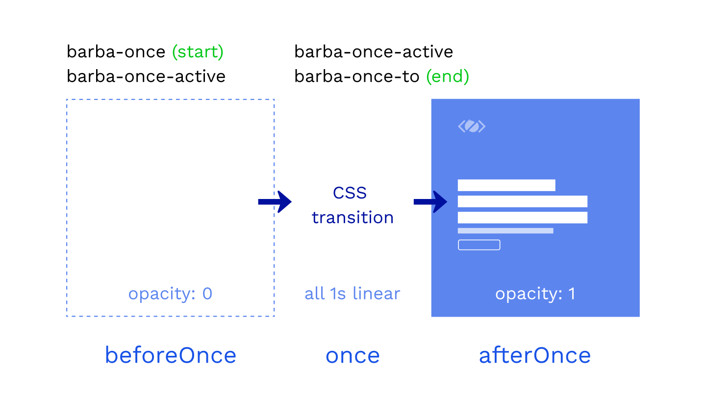
How long these classes stay on the container depends on the duration of the CSS transition or animation.
Because the CSS plugin overrides the main once hook, any code inside of once will be ignored. The same applies to the enter and leave hooks.
barba.init({
	transitions: [
        {
            once() {
                console.log('this will be ignored');
            },
            beforeOnce() {
                console.log('shows up BEFORE once transition');
            },
            afterOnce() {
                console.log('shows up AFTER once transition');
            }
        }
    ]
});
If you need to run any code related to the once transition use beforeOnce or afterOnce hooks.
How to customize the name of the CSS class?
You can customize the CSS classes by specifying a name for your transition.
transitions: [
    {
        name: "home",
        once() {}
    }
]
If you specify home as the name, Barba will generate these classes:
.home-once
.home-once-active
.home-once-to
The format of the class is always the same: .[name]-[hook]-[state].
How to create CSS transition between two pages

Every page transition has two phases.
Firstly the current page leaves, then the next page enters.
To use CSS transitions between two pages, we need to specify the hooks inside of the Barba transition, even if there is no code inside of them.
transitions: [
    {
        name: "fade",
        leave() {},
        enter() {}
    }
]
Now we can add the CSS transitions to the stylesheet.
/* =Fade out, fade in */
/* Fade out current container */
.fade-leave {
    opacity: 1;
}
.fade-leave-active {
    transition: opacity 0.3s linear;
}
.fade-leave-to {
    opacity: 0;
}

/* Fade in the next container */
.fade-enter {
    opacity: 0;
}
.fade-enter-active {
    transition: opacity 0.3s linear;
}
.fade-enter-to {
    opacity: 1;
}
1. Fade out the current page
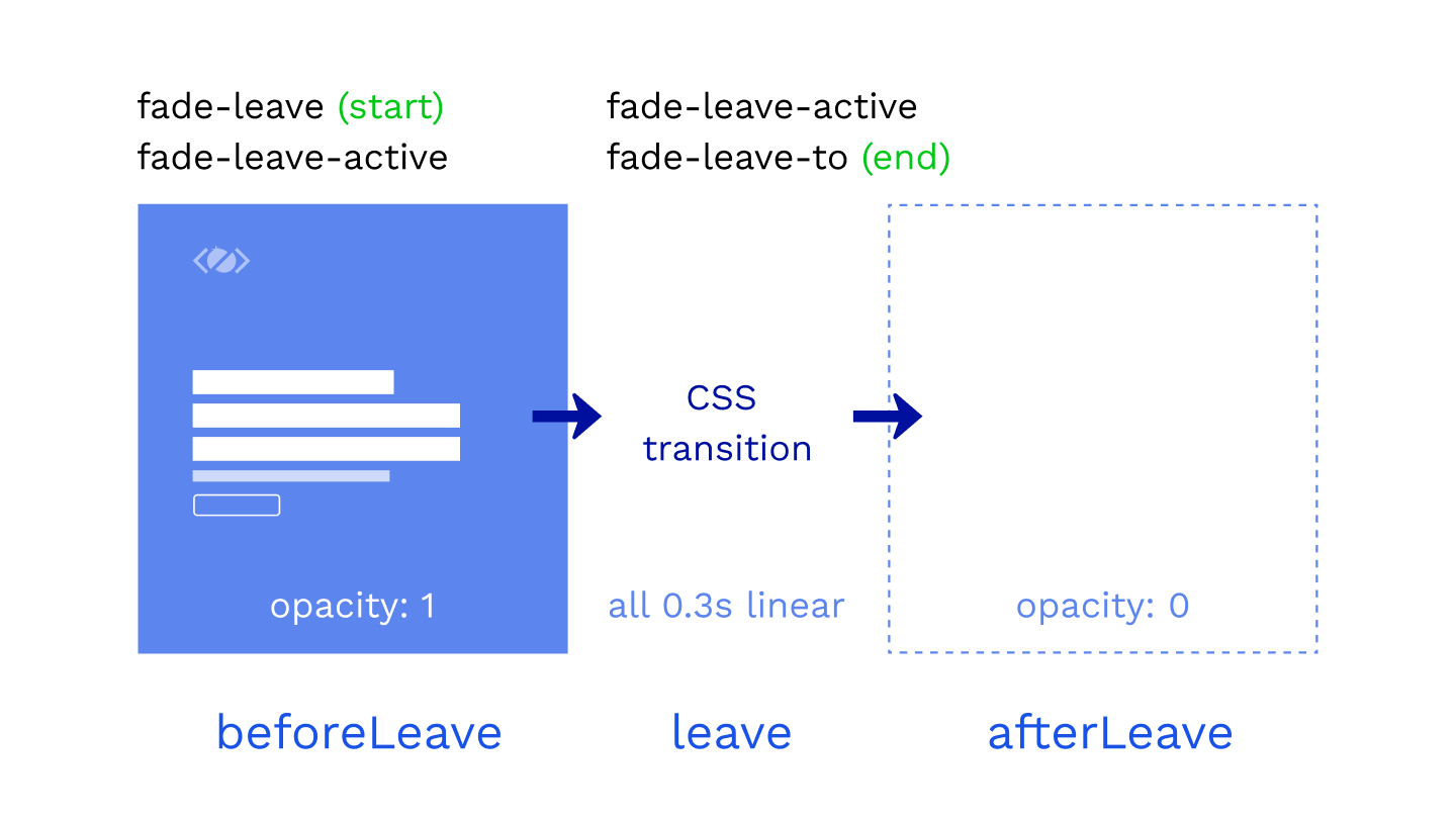
In the first phase of the transition, we are fading out the current page.
.fade-leave /* start of the transition */
.fade-leave-active /* CSS transition */
.fade-leave-to /* end of the transition */
The state of our container is opacity: 1 at the start of the transition and opacity: 0 at the end of the transition.
.fade-enter-active class defines the CSS transition that will be used, eg. opacity 0.3s linear.
2. Fade in the next page
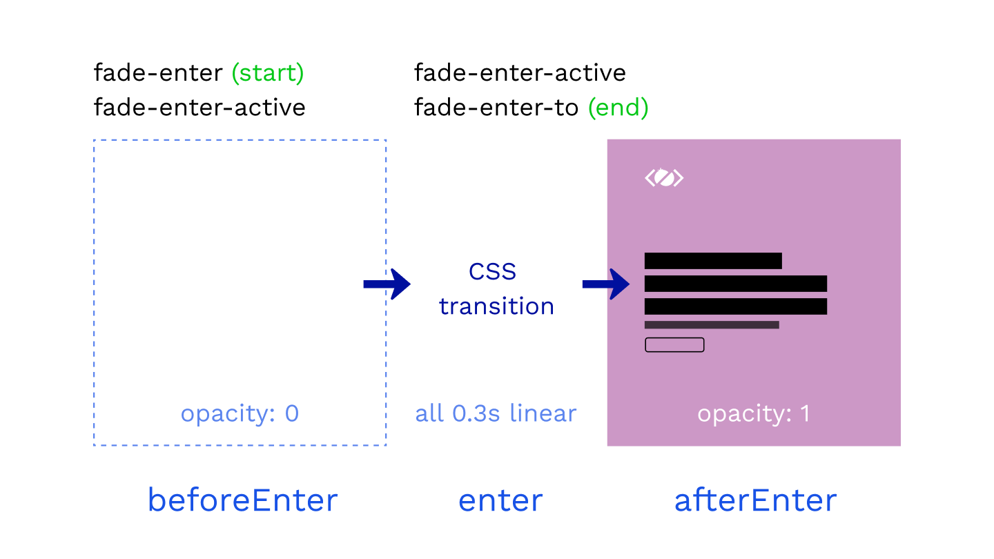
In the second phase of the transition, we are fading in the next page.
.fade-enter /* start of the transition */
.fade-enter-active /* CSS transition */
.fade-enter-to /* end of the transition */
We are starting from opacity: 0 and finishing with the page fully visible at opacity: 1.
Of course, you can combine the CSS selectors if the styles are the same.
/* =Fade out, fade in */
/* Fade out current container */
.fade-leave,
.fade-enter-to {
    opacity: 1;
}
.fade-leave-active,
.fade-enter-active {
    transition: opacity 0.3s linear;
}
.fade-leave-to,
.fade-enter {
    opacity: 0;
}
Perfect, this was a simple fade transition, but what if wanted to make a transition where both containers are visible on the page? How would we do that with Barba.js?
Let’s see in the next example.
How to create clip-path transition
Now that you know the basics of Barba.js and the CSS plugin, only your imagination is your limit!
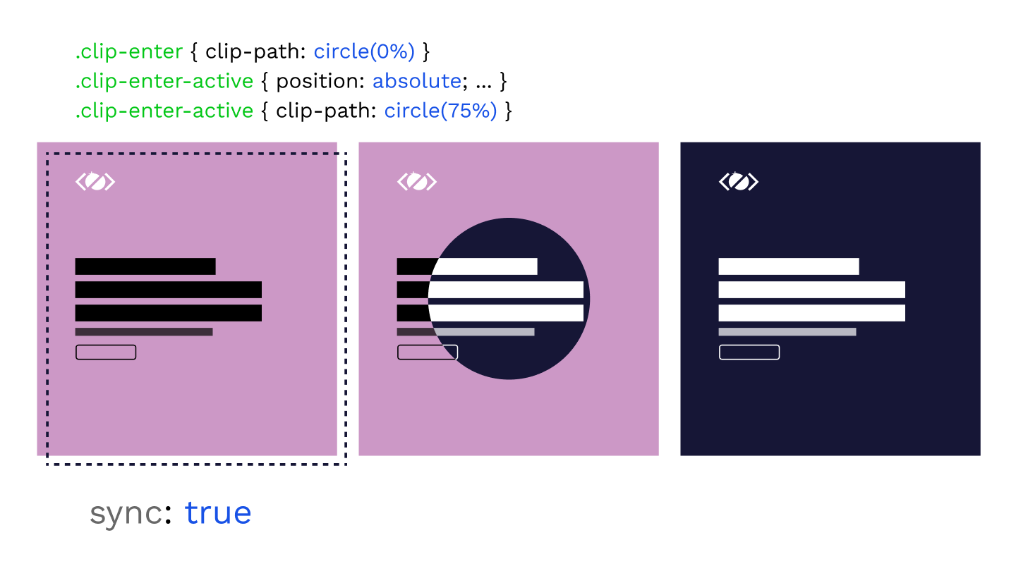
In the next example, we will try to reveal the next page from the center of the screen.
We will clip the incoming page clip-path: circle(0%); at the start and reveal it by specifying clip-path: circle(75%); as the end of the transition.
For this effect, we need to have both containers on the page and Barba has a sync mode build-in exactly for that.
transitions: [
    {
        name: "clip",
        sync: true,
        leave() {},
        enter() {}
    }
]
This will append the next container to the page and we will have both containers available for the transition.
Without the sync mode, the current page is removed from the DOM just before the next page is appended.
/* =Clip-path transition */
.clip-enter {
    clip-path: circle(0%);
}
.clip-enter-active {
    position: absolute;
    top: 0;
    z-index: 2;
}
.clip-leave-active,
.clip-enter-active {
    transition: all 0.75s var(--easing);
}
.clip-enter-to {
    clip-path: circle(75%);
}
.clip-leave {
    opacity: 1;
}
.clip-leave-to {
    opacity: 0;
}
With both containers on the page, we are overlapping them by positioning the incoming page on top of the current page.
Then we are animating the clip-path from 0% to 75%.
At the end of the transition, the current page is removed from the DOM and the next is the new current.
Makes sense? I hope it does.
It is quite fun to play with these transitions. Agree?
Let me know in the comments.
How to create a cover transition
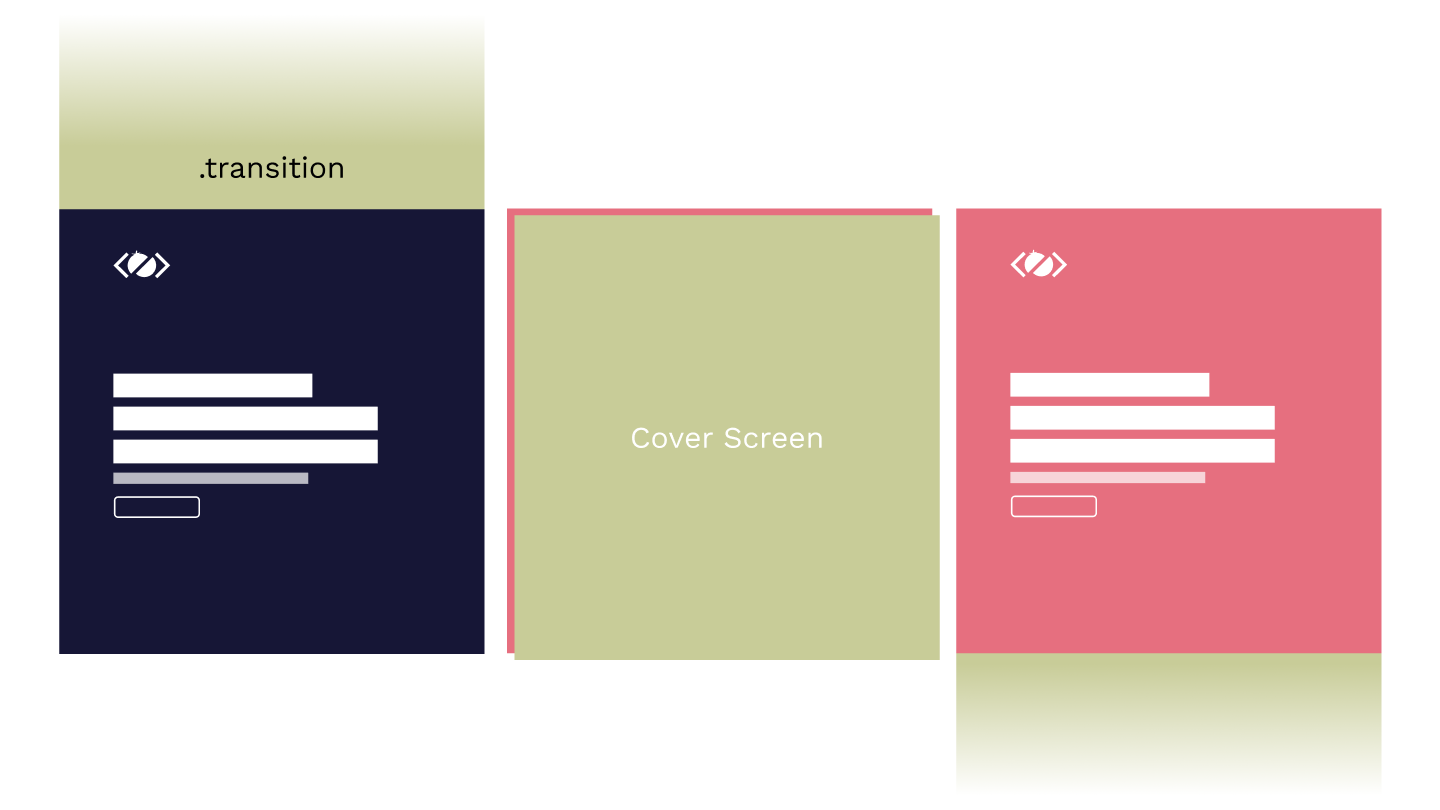
In this example, we will look at how to cover the current page and reveal the next page.
For this effect, we will need to include .transition element inside of each page.
<div data-barba="container">
    <div class="transition">
        <h2>Cover Screen</h2>
    </div>
</div>
This is a simple full-screen element covering the whole viewport, by default it is positioned outside of the viewport using transform: translateY(-100%);.
/* =Transition with cover screen */
.with-cover-leave,
.with-cover-enter,
.with-cover-leave-active .transition,
.with-cover-enter-active .transition {
    transition: transform 0.5s var(--easing);
}
.with-cover-leave .transition {
    transform: translateY(-100%);
}
.with-cover-leave-to .transition,
.with-cover-enter .transition {
    transform: translateY(0);
}
.with-cover-enter-to .transition {
    transform: translateY(100%);
}
In the first phase, we are transitioning the .transition element to translateY(0) using the .with-cover-leave-to .transition selector. This is also the starting position for the enter animation.
Then we are moving the .transition out of the viewport to transform: translateY(100%); using the .with-cover-enter-to .transition selector.
As you can see, the stylesheet could grow quite quickly.
Especially if you want to animate multiple elements in a sequence, that is where JavaScript animations with GreenSock come very handy.
How to create a slide transition
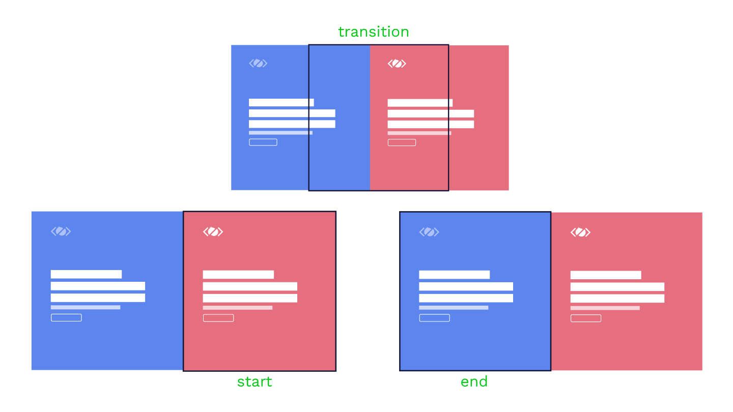
Now that you know what sync: true does, you can come up with any transition that needs both containers.
One of these transitions could be a slide transition.
.slide-leave,
.slide-enter-to {
    transform: translateX(0);
}
.slide-leave-active,
.slide-enter-active {
    transition: all 0.7s cubic-bezier(0.5, 0.7, 0.4, 1);
}
.slide-leave-to {
    transform: translateX(100%);
}

.slide-enter {
    transform: translateX(-100%);
}
.slide-enter-to {
    position: absolute;
    top: 0;
    left: 0;
}
At the start of the transition, we are using .slide-enter CSS class to position the incoming next page outside of the viewport.
Then we are animating both containers by 100%. The current page goes away from the viewport to translateX(100%) and the next page moves to translateX(0).
The page entering the viewport is positioned absolute during the transition as we have defined in the .slide-enter-to CSS class.
And that is it, now you have learned how to create 4 different page transitions using Barba.js and the CSS Plugin.
Final Demo
Things to remember
- You need to add an empty hook to your JS, to use CSS transition for that hook!
- The JavaScript code in
once,enter,leavehooks will be ignored! beforeOnce,afterOnce,beforeEnter,afterEnter,beforeLeave,afterLeavecan be used.- Currently, there is a bug with the back button not triggering the transition.
Related Resources
- How To Make Page Transitions in HTML – Barba.js and GSAP3 Tutorial
- Barba 101 – Free Online Course
- GreenSock 101 – Free Online Course
- Practical GreenSock – Premium Online Course
Conclusion
As you can see from the above examples, you can create some interesting page transitions using CSS transitions.
You have learned how Barba.js and the CSS plugin works and which CSS classes are applied to your container during the page transition.
Have you seen any cool page transitions on the web?
Let me know in the comments and don’t forget to check out some of my online courses to learn even more about creative front-end development.


Hi,
I get the next page flickering in and then the animations kick in. Is there an easy way round this?
Hey Ollie, not sure what the flickering issue is. The best way would be to set up a CodePen or SandBox demo. Also, Barba has a Slack channel that you can join if you need more help.