Category Archives: Web development

TailwindCSS 2.0

TailwindCSS 2.0 – What’s new in TailwindCSS?

We will firstly recap how it works, then dive into what’s new in TailwindCSS 2.0?

In short TailwindCSS is a great way to keep your CSS stylesheet lean over time.

What is TailwindCSS?

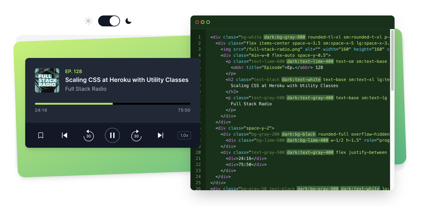
TailwindCSS is a utility-first CSS framework, that gives you small building blocks that you can use to build your UI components.

Instead of writing CSS in the stylesheet you are adding TailwindCSS classes directly to html elements.

This might feel weird at the start, but once you get used to it, you will feel much more productive.

Great for UI Components

<span className="bg-blue-500 text-white text-xs py-1 px-2 rounded-md mb-4 inline-block">
    Coming Soon!
</span>

bg-blue-500 will apply a predefined shade of blue to your element as background-color: #0070f3.

text-white will apply color: white.

py-1 is used to define padding-top and padding-bottom, while px-2 is used to define padding-left and padding-right.

You see how reading these classes makes sense?

Are you completely new to TailwindCSS?

TailwindCSS Playground is the best way to play around with it before you invest some time and try to set it up on your project.

I will also cover some basics of TailwindCSS in my upcoming Next.js 101.

TailwindCSS 2.0 – What’s New?

The new version of TailwindCSS has been announced in some style.

I am not a big fan of the overdramatic background music, but there are some very useful additions to the functionality.

New TailwindCSS Website

Together with the new version, TailwindCSS has also a brand new website worth checking out.
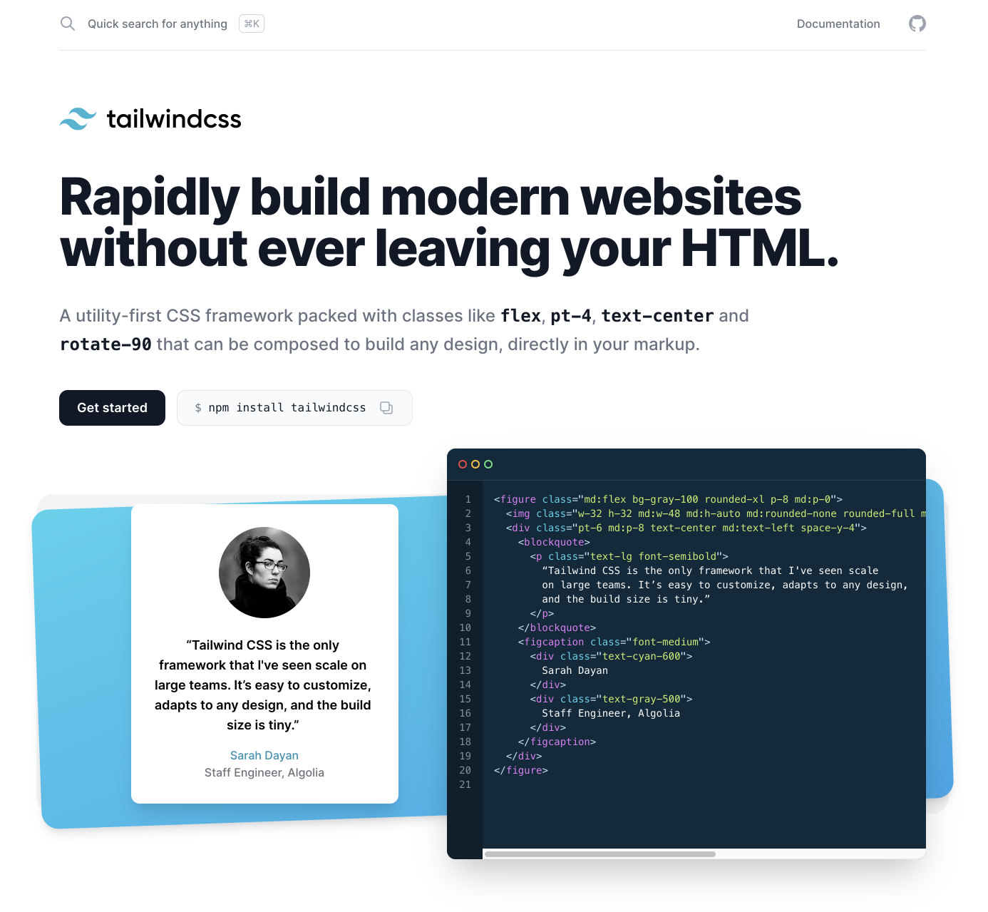
TailwindCSS 2.0 Website

It is build using Next.js and the interactive animations are done using Framer Motion.

Of course all the styling has been done using TailwindCSS.

From my behind the scenes sources: it has been build by Brad Cornes in under 2 weeks!

Now what’s new?

Updated Features in TailwindCSS 2.0
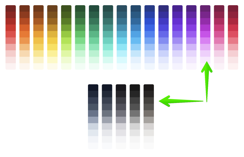
TailwindCSS 2.0 Color Scheme
  • Extended color palette – now you have move colors (22) and shades (10) to choose from
  • Extra-wide 2XL breakpoint2xl: is targeting 1536px and above
  • Default line-heights per font-size – now every font-size has its own line-height specified by default
  • Extended spacing, typography, and opacity scales – now you can be more specific when defining margin, padding, font-size, or opacity
  • @apply@apply now works with anything, hover: did not work in the previous version
  • Group-hover and focus-within are now enabled by default. This is useful if you want to highlight a whole container if a button inside of it is in focus, or change the text color of all children if you hover over a parent div container.
  • Default CSS transition – predefine your CSS transition duration and easing and then only apply one class
  • Dropped IE11 support

New Features

TailwindCSS 2.0 Dark Mode

There you have it, quite a long list of updated and new features, that I am excited to try on my projects.

You can check the official release post for more details about TailwindCSS 2.0.

Conclusion

Which of these new or updated features are you most excited about? Or are you completely new to TailwindCSS? Let me know in the comments.

If you want to learn more about TailwindCSS, don’t forget to signup to Next.js 101.

Barba.js - Namespace, Rules and Conditions

Barba.js – Namespace, Rules, and Conditions

In the previous tutorial, we’ve covered how to create some cool page transitions using Barba.js and the CSS plugin. Today we will break down some the of terms associated with Barbas page transitions logic.

This will help you to trigger the right transition at the right time.

Barba.js Tutorial

What you will learn:

View Demo →Download Files ↓

What is a namespace?

Barba.js namespace

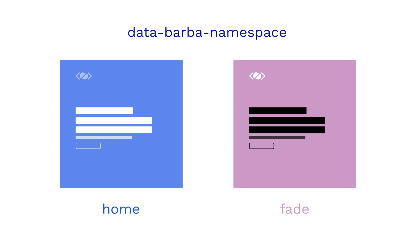
In simple terms, a namespace is the name of the page that you are leaving or entering.

It is defined on the data-barba="container".

<div class="wrapper" data-barba="container" data-barba-namespace="home">
    ...
</div>

This namespace is very useful if you want to define some rules for your page transitions.

When defining a transition in barba.init({...}) you can tell Barba to use this transition only if some conditions are met. More on conditions later.

There are many custom page transitions in the top award-winning websites.

The developers carefully consider which elements need to be animated out before the new page is animated.

In the CSS page transitions example, I have defined a different namespace for each page to be able to trigger different page transitions.

barba.init({
  transitions: [
    {
      name: 'home',
      to: { namespace: ['home'] },
      leave() {},
      enter() {},
    }, {
      name: 'fade',
      to: { namespace: ['fade'] },
      leave() {},
      enter() {},
    }
  ],
});

If we click on a link that takes us to fade.html, we play the fade transition. If we go to the index.html, the home transition will be used.

That’s how we have used namespace in the transition rule.

How to set rules for transitions?

Barba.js rules for transitions

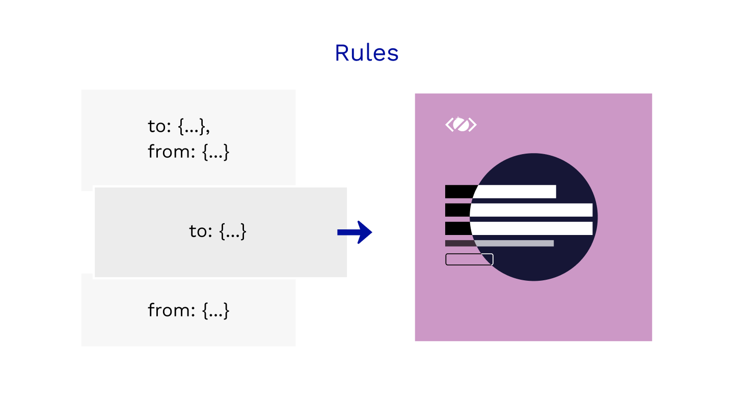
To define the rules we can specify to, from, or both keywords.

The transition with both keywords will always take a priority, followed by to and from.

namespace is not the only condition that you can use.

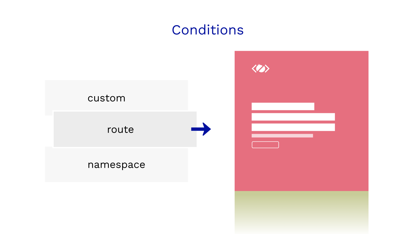
To make the rules even more flexible you can also define custom or route if you are using Barba Router.

Think about rules as if this is true, use this transition.

{
    name: 'home',
    to: { namespace: ['home'] },
    leave() {},
    enter() {},
}, {
    name: 'clip',
    // to: { namespace: ['home'] }, // this would make it stronger
    from: { namespace: ['with-cover'] },
    leave() {},
    enter() {},
}

Above are two transitions, one with the rule “to home”, the other one with “from with-cover” namespace.

What if the user goes from with-cover to home? Which one would be used?

The home because to is stronger than from.

If we would add to: { namespace: ['home'] } to the clip transition it would become stronger and would be used instead.

How to use a custom condition for your transition?

Barba.js conditions for transitions

Let’s say you have a special link on a page and you want it to trigger a special transition.

At the same time, you want any other link on that page to trigger a default transition.

You can use the custom condition like this:

{
    name: 'default',
    sync: true,
    from: { namespace: ['home'] },
    leave() {},
    enter() {},
},
{
    name: 'special',
    sync: true,
    from: {
        custom: ({trigger}) => {
            return trigger.text === 'Clip-Path Transition';
        },
        namespace: ['home']
    },
    leave() {},
    enter() {},
}

Any link on the home page would trigger a default transition, but clicking on Clip-Path Transition would trigger the special transition.

Do you see how powerful the rules are? That is how you can craft your page transitions based on many conditions.

custom is the strongest out of all conditions followed by route and namespace.

Barba applies a transition if all conditions are fulfilled.

For more details on the priorities of Barba.js transitions refer to the official documentation.

Do you want to learn even more about Barba.js? Join me in Barba 101 where we will cover Barba API in more detail. I hope to see you there.

Final Demo

View Demo Download Files

Conclusion

Mastering transition rules and knowing exactly which transition will be trigger when is the key.

Now you know how to use a namespace, set some rules, and use custom conditions for your page transitions.

I can’t wait to see how you will use it on your project.

Do you have any questions related to Barba.js or page transitions? Let me know in the comments.

Next.js Google Spreadsheets

Failing Build of Next.js and Google Spreadsheets

Are you trying to connect Google Sheets with your Next.js app?

I have come across an issue with failing builds when deploying to Vercel and to save you hours of debugging, here is what worked for me.

The Issue

All I wanted to do is to load data from Google Spreadsheet and display them in my React component. I am using Next.js and google-spreadsheets package.

In next.config.js I am setting up the environmental variables to be able to connect to the Spreadsheet when the page is served .

module.exports = (phase) => {
    ...
    const env = {
        ...
        private_key: (() => {
            if (isDev) return process.env.private_key
            if (isProd) return process.env.private_key
            if (isStaging) return process.env.private_key
            return 'private_key:not (isDev,isProd &amp;&amp; !isStaging,isProd &amp;&amp; isStaging)'
        })(),
        ...
    }
    ...
}

This worked fine locally but the build was failing when it was deployed to Vercel.

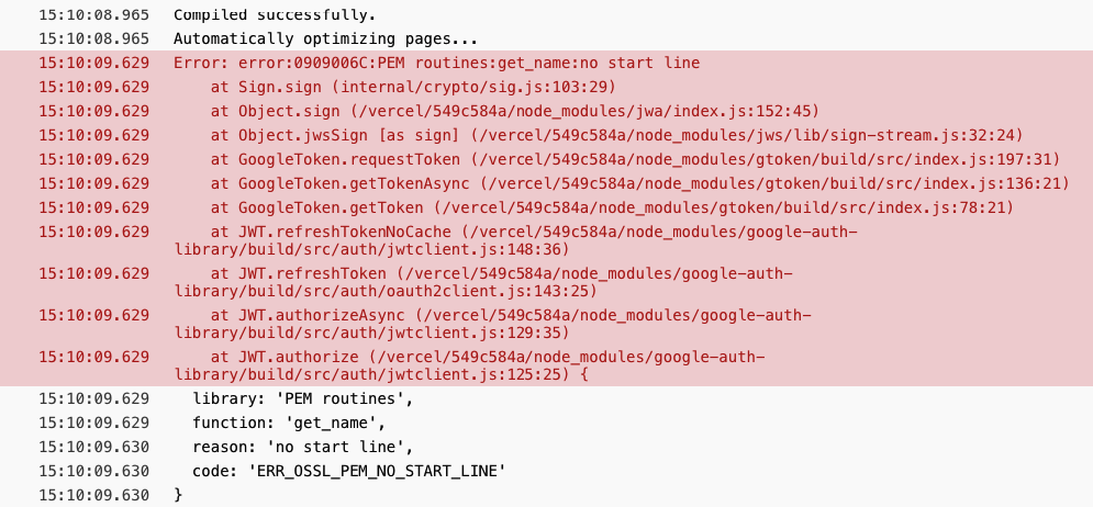
Error: error:0909006C:PEM routines:get_name:no start line

Here is the screenshot of the log.

Next.js + Google Sheets build error

After hours of debugging, calling for help and swearing at it, I had a look at how gatsby-source-google-spreadsheets works and there was the answer.

The Fix

To fix the issue I had to add .replace(/(\\r)|(\\n)/g, '\n') after the private_key.

if (isDev) return process.env.private_key.replace(/(\\r)|(\\n)/g, '\n')
if (isProd) return process.env.private_key.replace(/(\\r)|(\\n)/g, '\n')
if (isStaging) return process.env.private_key.replace(/(\\r)|(\\n)/g, '\n')

Happy times.

I am sure someone smarter than me can explain in the comments what exactly this regex does, I just know that it replaces \n with real line breaks.

React and GreenSock Tutorial

React and Greensock Tutorial for Beginners

This React and Greensock Tutorial is focusing mainly on the basics of targeting elements and using React Hooks with GreenSock.

If you have been following my blog and YouTube channel for a while, you know that I enjoy using React and GreenSock.

They are both very powerful libraries with elegant APIs.

As more and more websites are build using React, it’s important to know how to use GreenSock in the React world.

What will you learn:

Baby steps I know, but lets learn how to walk before you try to run.

If you prefer learning by watching videos, checkout React + GreenSock 101.

View Demo →Download Files ↓

1. How to include GSAP in your React Project

React and Greensock Tutorial for Beginners

I am assuming you already know how to spin up a brand new React project using the Create React App.

npx create-react-app gsap-app
cd gsap-app

Now we can install GreenSock through npm and start the app.

npm i gsap
npm start

Cool, GSAP is installed lets import it to our App component.

import React from 'react';
import { gsap } from "gsap";

const App = () => {
    ...
    return (
        <div className="App">
            <header className="App-header">
                <img src={logo} className="App-logo" alt="logo" />
            </header>
        </div>
    )
}

2. How to target elements using refs

Firstly we need to get access to the element that we want to animate.

We can use useRef because our App component is a functional component.

import React, { useRef } from 'react';
import { gsap } from "gsap";

const App = () => {
    
    const headerRef = useRef(null);

    ...
    return (
        <div className="App">
            <header ref={headerRef} className="App-header">
                <img src={logo} className="App-logo" alt="logo" />
            </header>
        </div>
    )
}

We are storing a reference to our header element in the headerRef variable.

You can read more about React Refs in the official documentation.

3. How to animate React ref using GSAP

With our header “selected”, we can create a tween that will play when the component mounts.

import React, { useRef, useEffect } from 'react';
...

const App = () => {
    
    ...

    useEffect(() => {
        
        gsap.from(headerRef.current, {
            autoAlpha: 0, 
            ease: 'none',
            delay: 1
        });

    }, []);

    ...
}

Firstly we need to import useEffect and create our tween inside of it.

The empty array as a dependency of this effect will make sure that our tween runs only on the initial mount of this component.

If you are new to React Hooks you can check my free online course React 101.

The target for our .fromTo tween is headerRef.current that is how we can access the underlying DOM element.

Ok, now we have our header fading in with a slight delay, but how do we animate when the state of our component changes?

4. How to animate when React state changes

React and GreenSock Tutorial

Lets create a button that will change the background color of the header.

But we could that with css class, right? Off course we could, but I thought you are here to learn React + Greensock.

import React, { useRef, useEffect, useState } from 'react';
...

const App = () => {
    
    const [background, setBackground] = useState('#5a7d95');
    
    ...

    const toggleBackground = () => {
        const color = background !== '#5a7d95' ? '#5a7d95' : '#1b4943';
        setBackground(color);
    }

    useEffect(() => {

        gsap.to(headerRef.current, { 
            backgroundColor: background, 
            duration: 1,  
            ease: 'none' 
        });

    }, [background]);

    return (
        <div className="App">
            ...
            <button onClick={() => toggleBackground()}>Change background</button>
            ...
        </div>
    );
}

We import useState, set the default color and create a function toggleBackground that will toggle the background color between light and dark.

Then inside of a new useEffect that only listens to the background color change, we are using GreenSock’s .to tween to animate the background-color to the right value.

Please excuse my non-creative animations today, I am trying to keep the example as simple as possible.

5. How to create an array of refs

React and GreenSock Tutorial

ScrollTrigger is the cool plugin from GreenSock that lets you trigger animations as the user scrolls through your page.

Let have a look how to include ScrollTrigger in your React project and fade in a few section.

import React, { useRef, useEffect, useState } from 'react';
import { ScrollTrigger } from 'gsap/ScrollTrigger';
gsap.registerPlugin(ScrollTrigger);

const sections = [
  {
    title: 'Title 1', 
    subtitle: 'Subtitle 1'
  },
  {
    title: 'Title 2', 
    subtitle: 'Subtitle 2'
  },
  {
    title: 'Title 3', 
    subtitle: 'Subtitle 3'
  }
];
...

We import ScrollTrigger and then register the plugin to make sure it survives the code tree shaking.

For this demo we are hardcoding some content in the sections array.

const App = () => {

    ...

    const revealRefs = useRef([]);
    revealRefs.current = [];

    const addToRefs = el => {
        if (el &amp;&amp; !revealRefs.current.includes(el)) {
            revealRefs.current.push(el);
        }
    };

    return (
        <div className="App">
            {
                sections.map(({title, subtitle}) => (
                    <div className="App-section" key={title} ref={addToRefs}>
                        <h2>{title}</h2>
                        <p>{subtitle}</p>
                    </div>
                ))
            }
        </div>
    );
}

Because we want to access multiple sections and trigger them individually, we need to create an array of refs revealRefs.

As you know from the above header example we get access to the underlying DOM elements in the .current property.

That is why we need to create a function addToRefs and add all our references to the sections to the revealRefs.current array.

6. How to use ScrollTrigger with React

Ok, great. We have access to all sections. Now lets loop over them and create new GSAP tween with scrollTrigger.

useEffect(() => {

    ...

    revealRefs.current.forEach((el, index) => {
        
        gsap.fromTo(el, {
            autoAlpha: 0
        }, {
            duration: 1, 
            autoAlpha: 1,
            ease: 'none',
            scrollTrigger: {
                id: `section-${index+1}`,
                trigger: el,
                start: 'top center+=100',
                toggleActions: 'play none none reverse'
            }
        });

    });

}, []);

We are looping over the revealRefs.current array and creating a simple .fromTo tween.

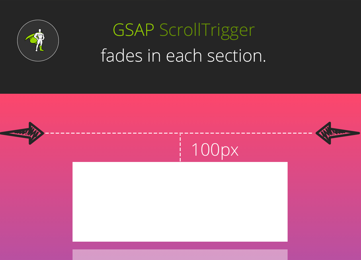
Each sections fades in when top of it is 100 pixels from the center of the viewport.

Again, today I could not think of a more creative way than just simply fading in a bunch of dummy sections.

React and GreenSock Tutorial Demo

View Demo →Download Files ↓

Do you want to learn more about React or GreenSock? Check out my free online courses React 101 and GreenSock 101.

Conclusion

Quite a long tutorial, but I hope that this guide will help you with implementing GreenSock in your React projects.

Do you have any questions related to GSAP and React? Let me know in the comments.

Barba.js Tutorial

Page Transitions Tutorial – Barba and GreenSock – Part 2

In the previous page transitions tutorial we have created a simple “take over” effect.

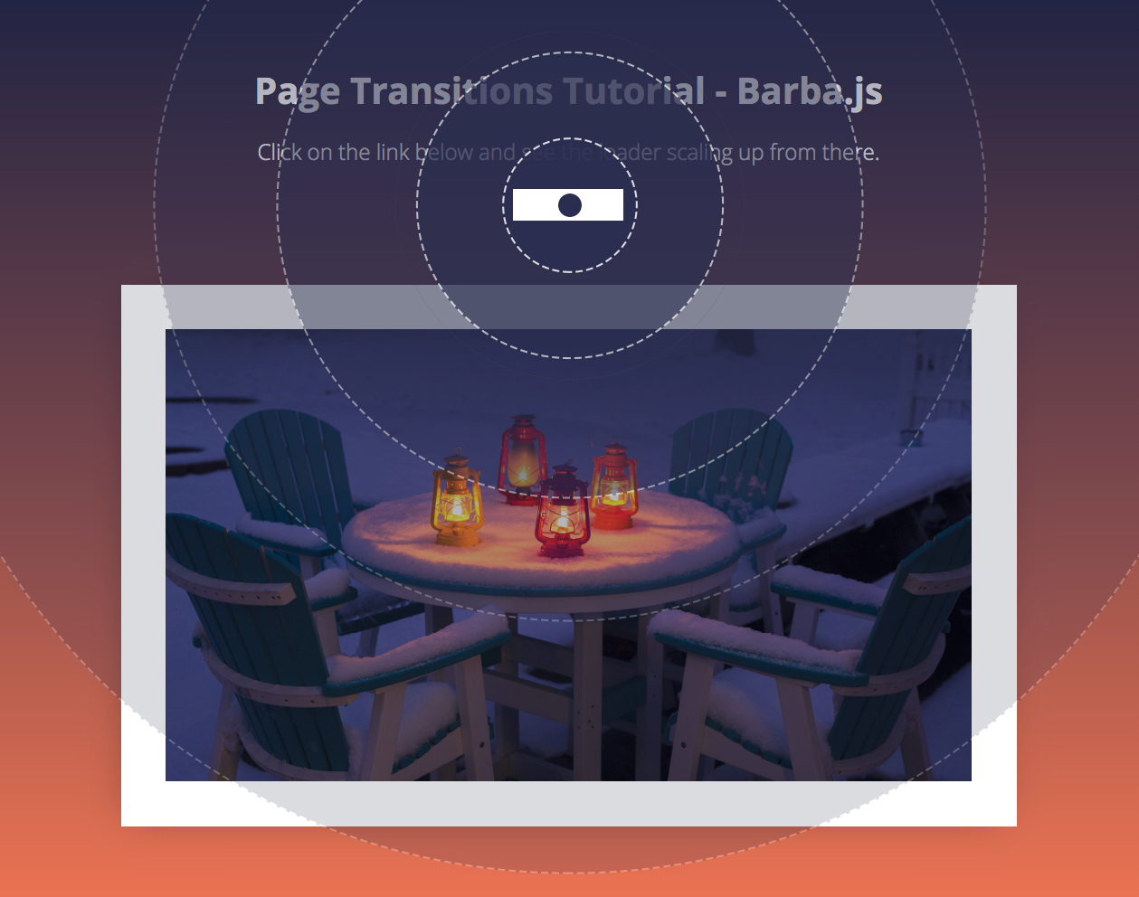
Today we will explore a little bit more about Barba.js and GreenSock and create a circular page transition.

Page Transitions Tutorial

What you will learn in this page transitions tutorial:

View Demo Download Files

Init Barba.js

The general setup of Barba.js is the same as in the previous tutorial.

barba.init({
    transitions: [{
        async leave({trigger}) {
            await loaderIn(trigger);
        },
        enter({next}) {
            loaderAway(next);
        }
    }]
})

We have two transitions leave() and enter(), but this time we are passing trigger to the loaderIn function and next to the loaderAway function.

How to scale up from where the user clicked

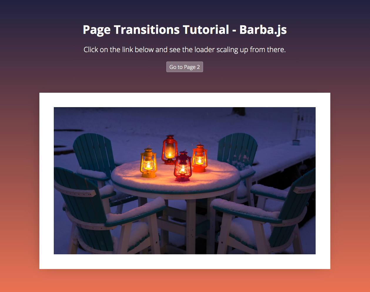
Page transitions tutorial

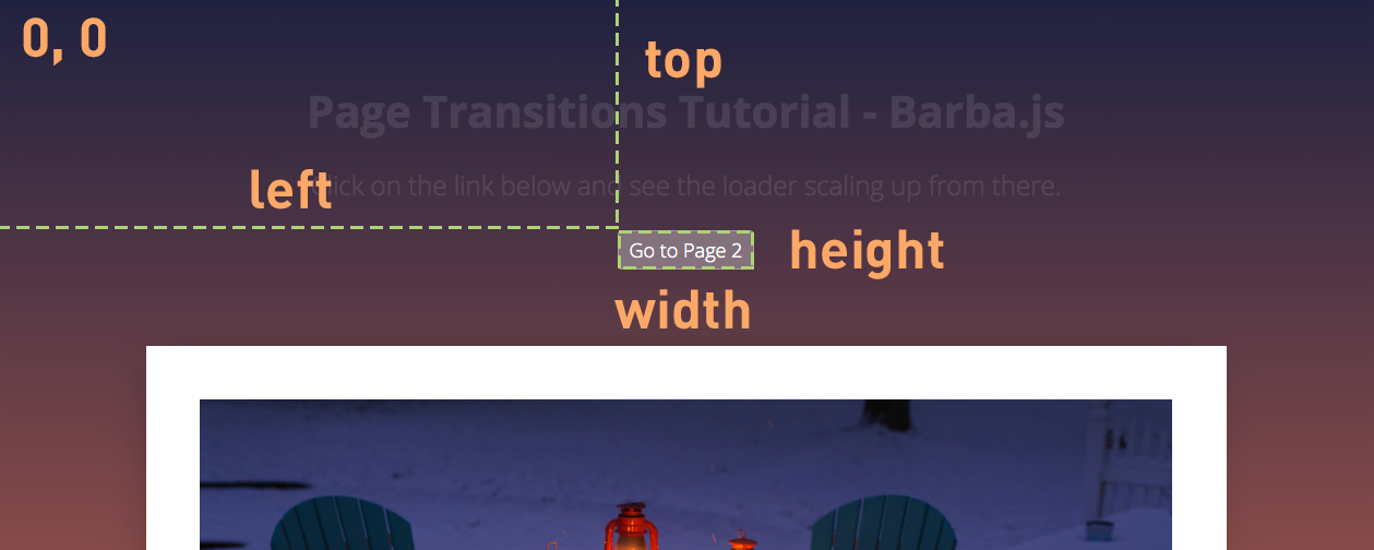
Each Barba.js hook receives the same data argument that contains the current and next page properties, it also includes trigger that is the link that triggered the transition.

You can read more about the Barba Hooks in the official documentation.

function loaderIn(trigger) {

    // get the size of the clicked trigger element
    const { height, width, top, left } = trigger.getBoundingClientRect();
    const triggerTop = Math.floor(top);
    const triggerLeft = Math.floor(left);
    const triggerWidth = Math.floor(width);
    const triggerHeight = Math.floor(height);

    // get viewport size, this will be used for scaling up the loader
    const viewportHeight = window.innerHeight;
    const viewportWidth = window.innerWidth;     
    const loaderSize = viewportHeight > viewportWidth ? viewportHeight*2 : viewportWidth*2;

    ...
}

We are firstly getting the dimensions of the trigger and its top and left offset relative to the viewport using the javascript getBoundingClientRect() method.

Secondly, we are getting the size of the viewport to be able to resize the loader accordingly.

Because the loader will always scale up from the center of the clicked element we need to make sure it is twice the size of the viewport.

How to use GreenSock for page transitions

GreenSock timeline

Now we need to create a GreenSock timeline that will scale the loader up.

function loaderIn(trigger) {

    ...
    const tl = gsap.timeline();
    tl
        .set(loader, {
            autoAlpha: 1,
            x: triggerLeft + (triggerWidth/2),
            y: triggerTop + (triggerHeight/2),
            width: loaderSize,
            height: loaderSize,
            xPercent: -50,
            yPercent: -50
        })
        .fromTo(loader, 
        {
            scale: 0,
            transformOrigin: 'center center'
        },
        { 
            duration: 0.8,
            scale: 1, 
            ease: 'power4.out'
        });
    return tl;

}

Firstly we use the .set tween to set the right position of the loader and resize it according to the viewport.

We use xPercent: -50 and yPercent: -50 to center, the middle of the loader in the center of the clicked link.

The .fromTo tween scales the loader from 0 to 1.

Regardless of where the link is on the page, the loader will always scale up from there and cover the whole screen.

Still with me? Lets keep going.

If you are new to GreenSock, checkout out my GreenSock 101 online course.

How to change the body class on page transition

Now let’s try to change the body class and display the correct background colors as defined in the stylesheet.

.is-home { background: #1f213f; }
.is-page-2 { background: #1c323d; }

Remember Barba.js only replaces the content of the data-barba="container”. This means that the body class would stay the same when navigating between the pages.

We have to manually update it like this:

function loaderAway(next) {
    document.body.removeAttribute('class');
    document.body.classList.add(next.container.dataset.class);
    ...
}

We are passing the next page to the loaderAway(next) function.

Inside of it, we are firstly removing the class attribute from the body tag and then applying the class that we have defined on the incoming page container as data-class="is-page-2”.

This will make sure that the body class is updated before we reveal the incoming page.

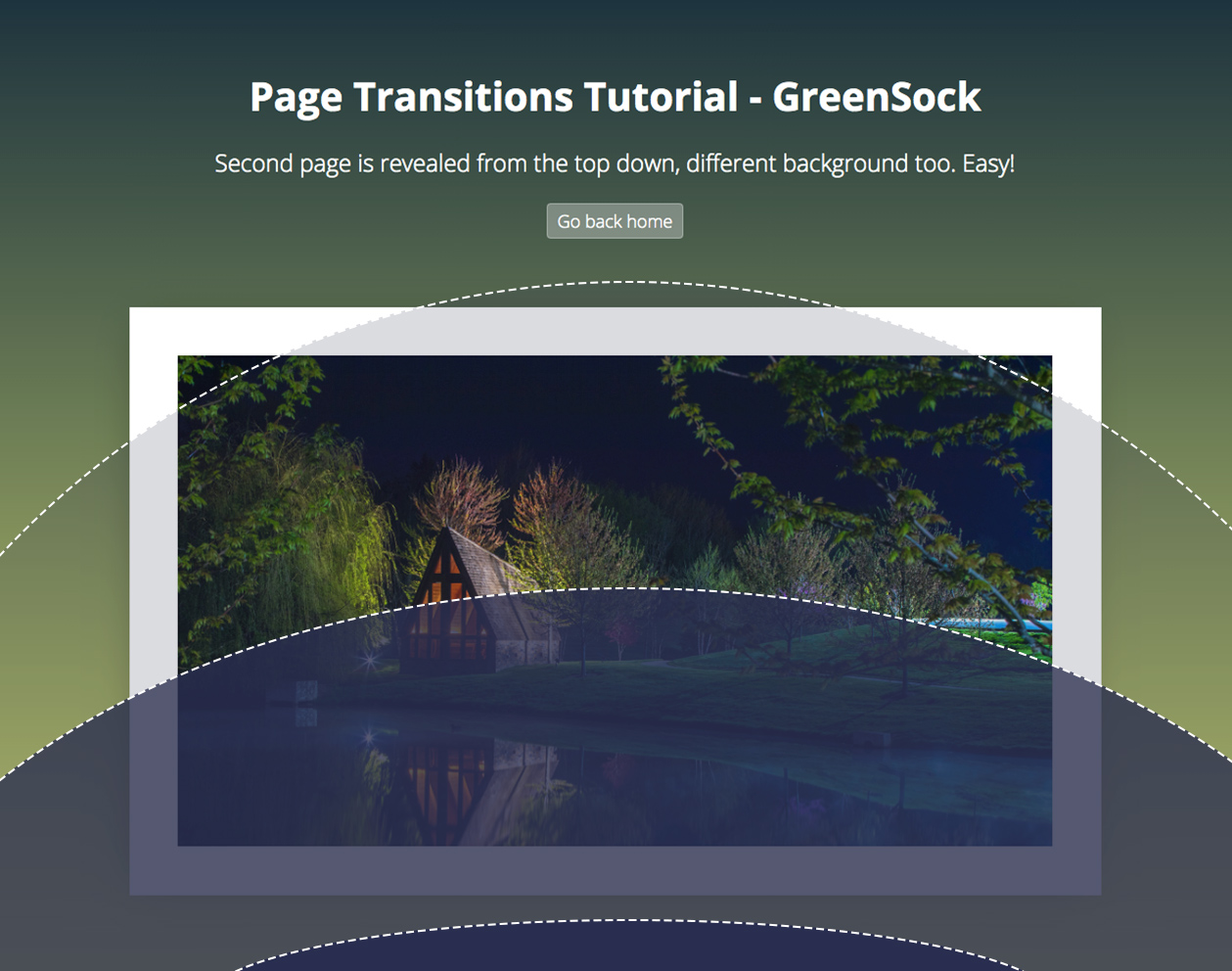
Reveal the new page

Page transitions tutorial

Now we have the whole page covered by the scaled-up loader, Barba updated the page under the loader and we are ready to reveal it.

The loader is a simple div, with a border-radius set to 100% to appear as a circle.

function loaderAway(next) {
    ...
    const h1 = next.container.querySelector('h1');
    const p = next.container.querySelectorAll('p');
    const img = next.container.querySelector('img');

    const tl = gsap.timeline();
    return tl.to(loader, { 
        duration: 1, 
        scaleX: 0.5, // squash the loader
        scaleY: 0.1, // squash the loader
        yPercent: 0, // move it down
        ease: 'power4.inOut'
    }).fromTo([h1, p, img], {
        autoAlpha: 0
    }, {
        duration: 0.9, 
        autoAlpha: 1, 
        stagger: 0.02, 
        ease: 'none'}, 
    0.3);
}

We can access the content of the incoming page by getting the right selectors from next.container.

Then we can reveal it in whatever fashion we want.

The .to tween above is squashing it down and moving it away from the viewport using the yPercent: 0.

With a slight 0.3s delay and a short stagger offset we are also fading the content in.

Final Demo

View Demo Download Files

Related Resources

Conclusion

And that is it, now you know how to create a circular page transition using Barba.js and GreenSock. If you are new to GreenSock, checkout GreenSock 101 where you can learn even more about this powerful animation library.

Have you seen any cool page transitions that you would like to see covered in my future page transitions tutorial?

Let me know in the comments.

Barba.js - Fluid smooth page transitions

How To Make Page Transitions in HTML – Barba.js and GSAP3 Tutorial

Page transitions are a thoroughly popular tool to help make your website stand out!

Smooth, fluid, and creative transitions often sets awarding winning websites apart from the rest.

Page Transitions Tuturial

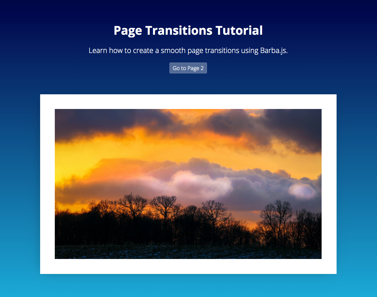
In this tutorial we will demonstrate how to create a simple page transition using Barba.js and GreenSock.

What you will learn:

View Demo Download Files

Introduction to Page Transitions

Whilst creating page transitions may sound difficult, Barba.js makes the process incredibly easy.

There are two types of page transitions:

Now, let’s walk through the process of creating a loading screen page transition on a project with 2 static html pages.

/css/app.css
/js/main.js
index.html
page2.html

1. Create a loading screen

Page Transitions Tutorial

Firstly, we will create a loading screen .loader. This will be a container that will cover our screen while Barba.js is loading the next page.

<div class="loader"></div>

.loader {
    position: fixed;
    width: 100vw;
    height: 200vh;
    pointer-events: none;
    background-color: #FFF6ED;
    z-index: 1;
    visibility: hidden;
    opacity: 0;
}

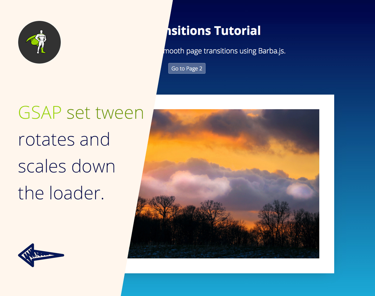
We will make it position: fixed and the height twice as tall as the screen height: 200vh. This is because we will soon be slightly rotating it. Without any rotation a height: 100vh would be enough to cover the whole screen.

Opacity and visiblity are set to 0 and hidden, because we don’t want to see a flash of the loader before GSAP scales it down.

// reset position of the loading screen
gsap.set(loader, {
    scaleX: 0, 
    rotation: 10, 
    xPercent: -5,
    yPercent: -50, 
    transformOrigin: 'left center', 
    autoAlpha: 1
});

In the main.js we are rotating the loader and setting the scaleX to 0 to make it invisible for the user. At the same time we are setting visibility: visible and opacity: 1 using GreenSock’s handy autoAlpha property.

2. Include Barba.js

Barba.js - Fluid smooth page transitions

Include Barba.js at the bottom of both HTML files.

<script src="https://unpkg.com/@barba/core"></script>
<script src="https://cdnjs.cloudflare.com/ajax/libs/gsap/3.3.4/gsap.min.js"></script>
<script src="js/main.js" defer></script>

I am also including GreenSock because Barba.js is not an animation library – it only takes care of content loading.

Your preferred animation library and style of page transition is completely up to you.

I tend to choose GreenSock for its flexibility and easy functionality. I have also become very familiar with it.

If you want to learn how to use GreenSock from scratch, check out GreenSock 101.

There are plenty of other animation libraries that would also work well, such as popmotion, animejs, mojs or spirit.

3. HTML Markup

Barba.js requires two special data-attributes somewhere in your markup.

<body data-barba="wrapper">
    <!-- content that stays the same on all pages - eg. header -->
    <div id="intro" data-barba="container">
        <!-- content that will change from page to page -->
    </div>
    <!-- content that stays the same on all pages - eg. footer -->
</div>

data-barba="wrapper" specifies the main wrapper of your page structure. This could be in the body or any other HTML element.

data-barba="container" is a section of your page which will be “reloaded or updated,” with the incoming content from the other page.

Anything outside of the container will not change between the page transitions.

You can use any markup you want, the only requirement is that the wrapper always needs to wrap the container.

4. Init Barba.js

barba.init({
    transitions: [{
        async leave() {
            await loaderIn();
        },
        enter() {
            loaderAway();
        }
    }]
});

In the main.js, we then initiate Barba.js to create our transition.

leave() will be executed first, followed by enter().

loaderIn() is a function that returns GSAP tween which stretches our .loader to cover the whole screen.

loaderAway() is a function that returns GSAP tween which scales the loader back to scaleX:0, when the new page is loaded underneath it.

5. GreenSock Animations

Page Transitions Tutorial

Now let’s have a look at the two tweens which create the transition.

function loaderIn() {
    // GSAP tween to stretch the loading screen across the whole screen
    return gsap.fromTo(loader, 
        {
            rotation: 10,
            scaleX: 0,
            xPercent: -5
        },
        { 
            duration: 0.8,
            xPercent: 0,
            scaleX: 1, 
            rotation: 0,
            ease: 'power4.inOut', 
            transformOrigin: 'left center'
        });
}

fromTo tween takes care of the first half of transitions and covers the screen when it’s completed.

We are setting the transformOrigin to be 'left center'. This makes it grow from left to right.

Page Transitions Tutorial
function loaderAway() {
    // GSAP tween to hide loading screen
    return gsap.to(loader, { 
        duration: 0.8, 
        scaleX: 0, 
        xPercent: 5, 
        rotation: -10, 
        transformOrigin: 'right center', 
        ease: 'power4.inOut'
    });
}

This tween reveals the new page which was loaded underneath the loader by Barba.js.

By changing the transformOrigin to 'right center' we create the effect of the loader disappearing on the right side of the screen.

6. Before and after the transition

Barba.js also gives you access to specific lifecycle methods or hooks that you can tap into.

One common example would be to add css class to your page to prevent users from double clicking on links.

// do something before the transition starts
barba.hooks.before(() => {
    document.querySelector('html').classList.add('is-transitioning');
});
// do something after the transition finishes
barba.hooks.after(() => {
    document.querySelector('html').classList.remove('is-transitioning');
});
.is-transitioning {
    pointer-events: none;
    cursor: progress;
}

Another example would be to enable scrolling to the top of the newly loaded page. We can use .enter hook for that.

// scroll to the top of the page
barba.hooks.enter(() => {
    window.scrollTo(0, 0);
});

Final Demo

View Demo Download Files

Related Resources

Conclusion

This may have been just a basic example, however I hope you can now see implementing page transitions can be a simple task!

The ultimate key is to master Barba.js and an animation library of your choice. If you’d like to go with GreenSock, learn everything you’ll need to know at GreenSock 101.

Today we really only scratched the surface of page transitions. It is a broad area, with lots of creative options out there.

So, if you have you seen other interesting page transitions you would like to learn about, please let me know! I’d be happy to make more in-depth page transition tutorials.