The Apple Worldwide Developers Conference (WWDC) held in San Francisco earlier this week introduced a few new Apple products and updates.
While the hugely expected iPhone 6 Nano with super narrow display hasn’t been revealed yet, the new iOS 7 caused a huge debate around the “flat” icons and updated UI design.
What stood out for me was the new Apple Mac Pro with its futuristic black design and a power house configuration. This futuristic product is also showcasing its features on a great looking website at www.apple.com/mac-pro/ which is full of interesting effects.
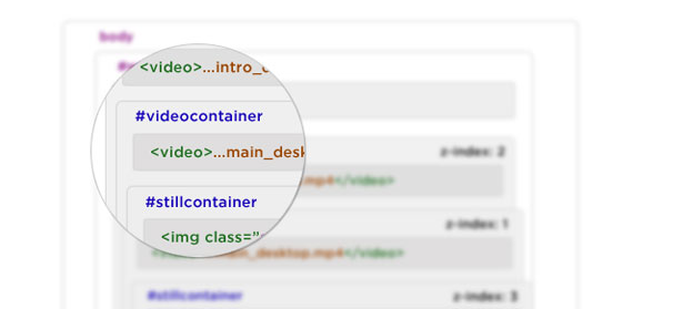
To better understand what is happening on the page, have a look at the simplified html page structure below.
Now lets have a look at how some of the fancy effects were created.
Introduction video sequence
There are two video files used on the page:
- A short 4 second (1.4MB, Codec H.264, 2,700kb/s) intro and
- A 49 second (19.5MB, Codec H.264, 3000kb/s) main video clip
<!-- On Page Load -->
<div id="introcontainer">

	<video src="macpro_intro_desktop.mp4"></video>

</div>
<div id="videocontainer"></div>
<!-- After Intro Playback -->
<div id="introcontainer" style="display: none;">

	<video src="macpro_intro_desktop.mp4"></video>

</div>
<div id="videocontainer" style="display: block;">

	<video src="macpro_main_desktop.mp4"></video>

</div>
The intro clip <video src="macpro_intro_desktop.mp4"> in the div#introcontainer is loaded first. After it finishes playing the <video src="macpro_main_desktop.mp4"> tag is injected into div#videocontainer which is then set to display: block, while the div#introcontainer is set to display: none.
div#introcontainer has a higher z-index and the last frame of the intro video is also the first frame of the main one, that means that you don’t see any transition.
Scrolling down
When you scroll down the page the main nav#globalheader fades out and moves up, thanks to -webkit-transform: translate3d(0, -20px, 0);.
<!-- Nav on page load -->
<div id="navcontainer">

	<nav id="globalheader" class="visible" style="opacity: 1; -webkit-transform: translate3d(0, 0px, 0);">
		...
	</nav>

</div>

<!-- Nav after scroll down -->
<div id="navcontainer">

	<nav id="globalheader" class="" style="opacity: 0; -webkit-transform: translate3d(0, -20px, 0);">
		...
	</nav>

</div>
Selecting one of the sections in the side-navigation bar plays the video forwards or backwards to the appropriate time point. This is based on the data-seek-time attribute of the clicked li.
<ol class="list">
	<li data-seek-index="1" data-seek-time="2" class="active">...</li>
</ol>
The main navigation then fades in on the last “Later This Year” panel. Thanks to opacity set to almost 1 and visibility set to visible.
element.style {
	opacity: 0.9999999999999956;
	-webkit-transform: translate3d(0, 0px, 0);
}
#desktop .clip.visible {
	visibility: visible;
}
Fade Out effect between panels
If you use the section navigation on the right side and jump further than the next or previous section, you will see a nice fade out and fade in effect. This is thanks to div#curtain.
All direct child elements of #wrapper are positioned absolute on top of each other and their individual z-index values take care of the visual order.
Curtain hidden HTML/CSS
<div id="wrapper">
	<div id="navcontainer">...</div>
	<div id="introcontainer">...</div>
	<div id="videocontainer">...</div>
	<div id="stillcontainer">...</div>
	<div id="panelcontainer">...</div>
	<div id="curtain"></div>
</div>
#curtain {
	height: 100%;
	width: 100%;
	background: #000;
	position: absolute;
	z-index: 30;
	opacity: 0;
	-webkit-transition: opacity 0.6s ease-out;
	-moz-transition: opacity 0.6s ease-out;
	transition: opacity 0.6s ease-out;
}
Curtain visible HTML/CSS
<div id="curtain" style="display: block" class="fadeOut"></div>
#curtain.fadeOut {
	z-index: 10000;
	opacity: 1;
}
On navigation click the div#curtain is set to display:block and gets an additional class fadeOut. This class is then removed when the video in the background rewinds to the appropriate time, and a still image of that time point is displayed on top of the video.
These assets are shown in the overview image as two images in #stillcontainer with the class still still_1 clip. The current section image has an additional class of visible crossFade.
There are a total of 13 video overlay images img.still.clip, with a few section sharing the same image.
If you are still having trouble understanding the structure of the page layers, have a look at a more visual demonstration below.
Conclusion
I hope that this deconstruction answers some of your questions about how the Apple Mac Pro page was built.
As always, feel free to leave a comment or ask any questions below.
Enjoy responsibly.
Like What You're Reading?
Sign up to receive my future tutorials and demos straight to your inbox.
No spam, Unsubscribe at any time.


Nothing about seeking the video in reverse?! That’s the part I was really interested in: mainly the codec and keyframe settings for the video that keep it from chugging.
The videos are using Codec H.264, 3000kb/s and regarding the reverse play, you might find this code helpful http://bit.ly/14Am4Uy.
Thanks for reading and the comment.
I wanna make this type of animation by copying the code, but forgive my dumbness, i am new the HTML/CSS and i wanna do this weebly html editor. how do i load the video to play with html. i mean where? and ps: I DON’T HAVE ANY WEBSPACE
thank you..
By the way… i came here from codrops…
You are welcome Arun, hope you have learned something new.
Neat! gonna apply internally to remake something simular during fall/ during vacation 😀
Thank you for posting!
Thanks Eric. Let us know if you create something using the techniques mentioned above. Have fun.
Nice to see that done without me trawling source, good to see Apples sow progression to newer technologies in there markup.
I thought that this could save time to a lot of developers. Stay tuned for more deconstructions like this and thanks for the comment Mathew.
Awesome deconstruction of the website! Thank you! I’m making a website atm so this is very helpful!
But i was wondering : This page works perfectly on safari mobile browser on iOS, it plays the video smoothly and nicely, but other pages that has video in the “Background”, like the Kickstarter mobile page, well, on the mobile browsers they don’t work! The video doesn’t play for Safari mobile Browser.
wondering why…
Hm hard to say why Kickstarter developers didn’t try to implement the video also on mobile phones.
In general the video playback is very inconsistent across devices and browsers.
When you also look at other things such as timeframes and budget, you need to make a decision whether the implementation on mobile devices is worth it. That might be the case for Kickstarter.
Why opacity: 0.9999999999999956; and not just opacity:1; ?
Looks like the opacity is calculated in javascript, it could have been rounded up to make it 1.
I’m new to this sort of programming. Do you have any idea how they built the ‘scroll to continue’ function?
Hi Maximilian, clicking the “scroll to continue” basically animates the page to the first slide. It is a similar effect as I described in the “Scrolling down” section of the article.
JavaScript then removes two classes “visible and show” from the “scroll to continue” container, which makes it disappear.
Hope that helps.
Good job!
Thank you.
Thanks for reading and leaving the comment Adash.
Any idea how the site works on mobile devices? It seems too smooth for a gif, and a video shouldn’t load inline on mobile safari.
Hi Will, looks like there is a canvas object for each of the sections. On the canvas is then played a sequence of still images. Hope that helps. Cheers
I was looking for indications for create a site such as the Apple Mac Pro page for a long time.
Thanks for everything has been really helpful to read your post, now I can do it too!
Great article! Thank you for that. What i am wondering, is if the video (mp4) is also used when viewing on an ipad. When i inspect and emulate an ipad with chrome i see that they also used the mp4 video. Do you know if the mac pro site uses an mp4 on the ipad or perhaps a png sequence? If i am correct, auto-play html mp4 video isn’t available for ipad or iphone without user interaction, see (http://stackoverflow.com/questions/12496144/can-you-autoplay-html5-videos-on-the-ipad).
How is the video paused and started after each sequence?
Hi Benjamin, it’s been a while since I did the deconstruction. If I remember correctly it was done using JavaScript and the data attributes.
Nice work. I like that you replied to each comment personally 🙂
Haha, thanks Sam. Here is your personal reply 😉 Thanks for reading!
any one know if someone is selling a theme like this so you can basically make a single product page.. a theme like this would be awesome for product launches..
i found this site does almost the exact same thing with the video.. forward and reverse scroll.. even audio at certain points
http://www.5emegauche.com/agence
Thanks for sharing this Timothy, I don’t know about a theme that lets you do a similar effects.
It’s a quite unique effect that requires you to hand code everything for scratch.
I am definitely going to make this into my new portfolio website in the near future.. i will hand code this forsure….
Why do they use both video and the still images? Any one of them would have done the job right?
Hi Faris, I will be honest it’s been a while since I looked at the site, but images might be a fallback for video for older browsers.
Any strong opinion as to why Apple did not use Sprite Mapping for the animation sequences? I feel using video is a clunkier feeling approach, whereas with Sprite Mapping you could have really smooth forwards and backwards animations controlled by scrolling.
Good question Jacob, do you have any handy resources on Sprite Mapping? Maybe other people reading this article might find it useful, myself included. Cheers Petr
Great work Petr, after I saw Jacobs comment I did some searching (the first couple of results were perfect) and found the following:
https://www.sitepoint.com/responsive-sprite-animations-imagemagick-greensock/
It’s an easy implementation of the sprite method, should work fine with a video, alas I’m not sure a long video is suitable (MacPro is 49seconds long).
In any case this tutorial plays well with the rest of your posts (ScrollMagic and GSAP).
Greets.
Thanks Boris for the tip!
How does the site control mouse scroll events? When you scroll on the webpage, (using the Mighty Mouse on a MacBook Pro), a single swipe up switches down one section. How does it stop from simply scrolling down 3 sections or something?
Can you deconstruct this site?
http://eng.getlost-getnatural.ru/
Just the homepage
*Just the scrolling on the homepage
I will check it out and might add a deconstruction to my YouTube channel. Thanks for the tip.
I am interested in the site’s menu on the right side…. is there a theme for this? a name this is called by? I like that as you scroll down, a new light glows for the next section on the page and that the name of that section appears.
Any thoughts?
Can you deconstruct this site?
https://locomotive.ca/fr/equipe
Just the page equipe
*hover people
I want to know more abuout the new macbook pro-website’s ‘touchbar’ effect.Is it similar to this effect?
http://www.apple.com/macbook-pro/
I am really interested in it.