In this tutorial we will create a scrolling website containing 4 fullscreen sections with images and a short description.
We’ll use Skrollr.js and to animate CSS3 transform: translate() of a large container to create smooth scrolling transitions between the slides.
What you’ll learn
- how to lay out your
html - how to use Skrollr for horizontal animations
- how to pause a scrolling animation
- how to animate like David Copperfield
- and much more
Related Screencast
Busy working on your own project? Jump to the individual sections.
- 1:22 – 1. Create slides container
- 3:27 – 2. Add individual slides
- 7:50 – 3. Position an image caption
- 11:50 – 4. Make the slides fullscreen
- 12:40 – 5. A scrolling helper
- 15:28 – 6. Adding Skrollr and the data-attributes
- 18:30 – 7. Pausing a scrolling animation
- 20:49 – 9. Final tweaks
Open the starting files, watch the video and follow the steps below.
1. Create Slides container
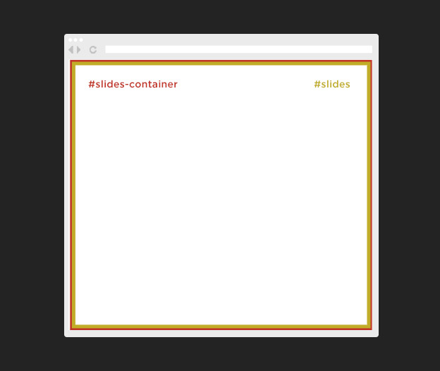
This will be our full width, full height container with an overflow hidden.
<div id="slides-container">
    <div id="slides"></div>
</div>
html, body {
    width:100%;
    height:100%;
}

/* full width/height container */
#slides-container {
    width: 100%;
    height: 100%;
    overflow: hidden;
}

/* double the height/width of a viewport */
#slides {
    width: 100%;
    height: 100%;
    position: fixed;
    top: 0;
    left: 0;
}
body and html are both resized to 100% width and height.
#slides is a container that will include all 4 slides.
Again it takes up the whole screen.
2. Add individual slides
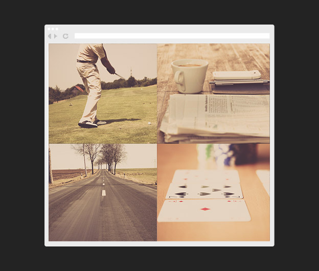
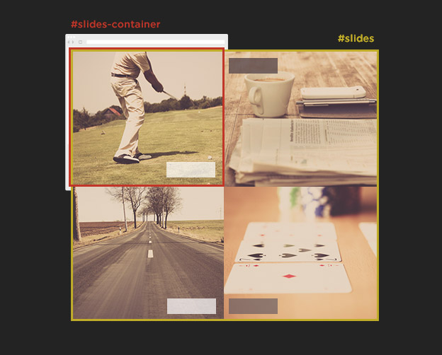
Next we’ll add 4 divs .slide and set the width and height to 50%.
This will make sure we can layout all 4 of these containers into each corner of the parent #slides.
<div id="slides-container">
    <div id="slides">
        <div id="slide-1" class="slide"></div>
        <div id="slide-2" class="slide"></div>
        <div id="slide-3" class="slide"></div>
        <div id="slide-4" class="slide"></div>
    </div>
</div>
.slide {
    position:absolute;
    top:0;
    left:0;
    width:50%;
    height:50%;
}
#slide-1 {
    background: url('../img/bcg_slide-1.jpg') no-repeat center center;
    background-size: cover;
}
#slide-2 {
    background: url('../img/bcg_slide-2.jpg') no-repeat center center;
    background-size: cover;
}
#slide-3 {
    background: url('../img/bcg_slide-3.jpg') no-repeat center center;
    background-size: cover;
}
#slide-4 {
    background: url('../img/bcg_slide-4.jpg') no-repeat center center;
    background-size: cover;
}
To position each slide into the right place we’ll use transform: translate();
/* Slide 2 goes to the bottom left */
#slide-2 {
    background: url('../img/bcg_slide-2.jpg') no-repeat center center;
    background-size: cover;
    -webkit-transform: translate(0,100%);
    -ms-transform: translate(0,100%);
    transform: translate(0,100%);
}
/* Slide 3 goes to the bottom right */
#slide-3 {
    background: url('../img/bcg_slide-3.jpg') no-repeat center center;
    background-size: cover;
    -webkit-transform: translate(100%,100%);
    -ms-transform: translate(100%,100%);
    transform: translate(100%,100%);
}
/* Slide 4 goes to the top right */
#slide-4 {
    background: url('../img/bcg_slide-4.jpg') no-repeat center center;
    background-size: cover;
    -webkit-transform: translate(100%,0%);
    -ms-transform: translate(100%,0%);
    transform: translate(100%,0%);
}
Now you probably asking yourself why did he set the .slide width and height to 50%, when we want them to be fullscreen?
Stay calm and keep reading.
3. Position an image caption
We’ll include a simple cation with a title and a description for each of the slides.
<div class="caption">
    <h1>Image 1 Title</h1>
    <p>Image description goes here.</p>
</div>
.caption {
    position: absolute;
    bottom: 5%;
    right: 5%;
    text-align: right;
    color: #fff;
}
p, h1 { margin: 0; }
h1 { margin-bottom: 0.2em; }
p { line-height: 1.333em; }
Nothing fancy here, just a simple container positioned to the bottom right corner of the slide with text aligned right.
Slide 3 and 4 will have a slightly different alignment so lets specify that.
#slide-3 .caption {
    left: 5%;
    right: auto;
    color: #47373f;
}

#slide-4 .caption {
    right: auto;
    left: 5%;
    top: 5%;
    bottom: auto;
    color: #47373f;
}
These two captions are positioned left and #slide-4 caption is also moved to the top by top: 5%; bottom: auto.
4. Make the slides fullscreen
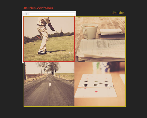
To make our slides fullscreen is pretty simple, look at the magic.
This is what David Copperfield tought me.
By simply resizing the #slides to 200% we will turn the slides from a quarter of the screen to a fullscreen size.
#slides {
    width: 200%;
    height: 200%;
}
Now our 50% is actually 100% of the viewport. Sounds confusing? I hope not.
5. A scrolling helper
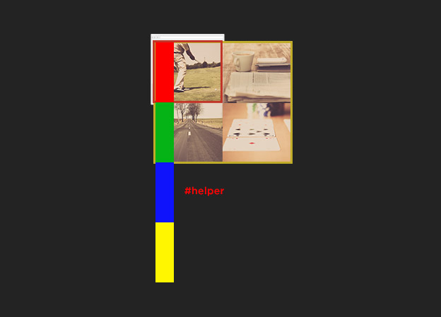
Remember we have set the width and height of #slides-container to 100% and also set the overflow to hidden, that means that we have nothing that makes the page scroll.
We will need to create a div which will be our magic helper.
David Copperfield is using many helpers for his tricks so why couldn’t we?
He’s always using some nice chicks, but we’ll have to stick with a pretty div with id #helper.
<div id="slides-container">
    ...
</div>

<div id="helper">
    <div class="marker red"></div>
    <div class="marker green"></div>
    <div class="marker blue"></div>
    <div class="marker yellow"></div>
</div>
#helper is placed under #slides-container and makes our page longer, it is a crucial html element on the page.
#helper {
    position:absolute;
    left:0;
    top: 0;
    height:400%;
    width: 20px;
}
.marker {
    height: 25%;
    width: 100%;
}
.red {
    background-color: red;
}
.green {
    background-color: green;
}
.blue {
    background-color: blue;
}
.yellow {
    background-color: yellow;
}
#helper is a container 4x taller then the viewport and we are also including 4 markers which will be our visual indication when we scroll 100% of the viewport down the page.
Now we have something to scroll.
6. Adding Skrollr and the data-attributes
Lets get to the exciting part of the tutorial.
Include Skrollr.js and initiate it on page load by including this code just before the closing body tag.
<!-- Include Skrollr.js -->
<script src="js/skrollr.min.js"></script>
<script type="text/javascript">
    var s = skrollr.init();
</script>
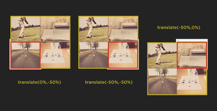
We will be adding skrollr data-attributes to animate our #slides container and reveal all 4 slides in a cool sequence.
<div id="slides"
    data-0="transform:translate(0%,0%);"
    data-100p="transform:translate(0%,-50%);"
    data-200p="transform:translate(-50%,-50%);"
    data-300p="transform:translate(-50%,0%);"
>
What we are telling the browser is to move #slides down (transform:translate(0%,-50%)), then left (transform:translate(-50%,-50%)) and up (transform:translate(-50%,0%)) every time we scroll down 100% of the viewport height (
Not sure how the Skrollr data-attributes work? You can learn it from scratch here.
Cool effect right, but as David Copperfields of the web development world, we can add one small trick and pause each of the scrolling animations for another 50% of the scroll duration.
This will make it an even bigger mystery to our magic trick.
How do we do that? Watch out.
7. Pausing a scrolling animation
Lets say we want to freeze each of the slides for 50% of the viewport height.
In other words we don’t want the Slide 2 and 3 move for a while and then scroll to the next slide.
We can include empty data attributes to create a keyframe and change the animation offsets.
The updated data-attributes would like this:
<div id="slides"
    data-0="transform:translate(0%,0%);"
    data-50p=""
    data-150p="transform:translate(0%,-50%);"
    data-200p=""
    data-300p="transform:translate(-50%,-50%);"
    data-350p=""
    data-450p="transform:translate(-50%,0%);"
>
Now every slides stays fixed for a while before scrolling to the next one.
If we want to keep our helper in sync we need to increase the size of it.
#helper {
    position:absolute;
    left:0;
    top: 0;
    height:600%;
    width: 20px;
}
The math is pretty simple. One of our slide animations now takes 150% of the viewport height and we have 4 slides, that is 150 * 4 = 600.
8. Fading out the caption
A little details can make a big difference and fading out the captions could make our page even more attractive.
Again we’ll use opacity and transform:translate() CSS3 properties for this magic moves.
<!-- Slide 1 Caption -->
<div class="caption"
    data-40p="opacity: 1; transform:translate(0px,0px);"
    data-70p="opacity: 0; transform:translate(0px,-100%);"
    data-anchor-target="#helper"
>

<!-- Slide 2 Caption -->
<div class="caption"
    data-130p="opacity: 0; transform:translate(0px,-200%);"
    data-180p="opacity: 1; transform:translate(0px,0px);"
    data-250p=""
    data-280p="opacity: 0; transform:translate(-100px,0px);"
    data-anchor-target="#helper"
>

<!-- Slide 3 Caption -->
<div class="caption"
    data-250p="opacity: 0; transform:translate(300px,0px);"
    data-300p="opacity: 1; transform:translate(0px,0px);"
    data-anchor-target="#helper"
>

<!-- Slide 4 Caption -->
<div class="caption"
    data-430p="opacity: 0;"
    data-450p="opacity: 1;"
    data-anchor-target="#helper"
>
As you can see, we are using #helper as our data-anchor-target.
That is the element which controls the timing of our animations instead of the caption elements themselves.
The first caption only animates out and the last one only fades in.
The duration (30p) and amount of pixels (-100px) for the animations out is shorter giving more emphasis on the caption animating in.
9. Final tweaks
We will visually hide our helper by changing the width to 0, but the element still needs to stay in the html markup.
Without it we would loose the chance to scroll down the page.
#helper {
    width: 0;
}
We will also tweak the animation of the first slide, because we don’t need any delay here. It could confuse users.
<div id="slides"
    data-0="transform:translate(0%,0%);"

    data-150p="transform:translate(0%,-50%);"
    data-200p=""
    data-300p="transform:translate(-50%,-50%);"
    data-350p=""
    data-450p="transform:translate(-50%,0%);"
>
By removing the data-50p="" data attribute we are removing this keyframe.
This means that the user scrolls down to a Slide 2 straight away without any delays.
10. Mobile and responsive
This tutorial only demonstrates how to use Skrollr to animate large container inside a smaller div with overflow.
In a nutshell this would be my approach for mobile devices:
- turn Skrollr off using enquire.js
- adjust our CSS for mobile and desktop breakpoint accordingly
Turn Skrollr off
We could use enquire.js like we did in my other tutorial.
Adjust CSS
We would remove the overflow: hidden from #slides-container and tweak the rest of our css to lay out our slides under each other.
Conclusion
I hope you’ve enjoyed another Skrollr tutorial and also learned something new about scrolling animations in general.
As you can see the possibilities are endless. Be creative. Be brave and most importantly have fun with scrolling animations.
Disclaimer
Please keep in mind that this tutorial is created only for educational purposes to help you get started with Skrollr.
Unfortunately I am not able to provide one on one support with your own projects.
Thanks for your support and understanding.
Resources: Images used in this tutorial are taken from Raumrot.com
Like What You're Reading?
Sign up to receive my future tutorials and demos straight to your inbox.
No spam, Unsubscribe at any time.


Nice Tutorial…
all i wanna say is that i really hate tomates too)))… never tried…yeah, and good tutorial
Thanks Alex, welcome to the club of tomato haters:)
Great Tutorial! I have added a fixed navigation menu but can’t seem to get the links to go to their destination. So click on link2 to go to slide-2. What suggestions do you have for me to go about this?
Did you ever get this figured out? I would like to do the same.
Have you guys figured this out? I’m having a similar problem.
It’s hard to tell because I’m not looking at your code, but to do something like that you would probably need to write some javascript and use jQuery easing for another sliding/transition effect. When I do single page websites and add a Navbar, adding js so someone can click on a link and take them to that section is helpful.
Here is a typical bootstrap navbar
<!– –>
Title
Services
Why Us
Pricing
Contact
Notice how each has a class of “page-scroll”, and the is an id.
For each section, you can have it go to the slide number. So your javascript might look something like this;
$(function() {
$(‘.page-scroll a’).bind(‘click’, function(event) {
var $anchor = $(this);
$(‘html, body’).stop().animate({
scrollTop: $($anchor.attr(‘href’)).offset().top
}, 1500, ‘easeInOutExpo’);
event.preventDefault();
});
});
What this code does is make a function, and takes the page scroll as a jQuery element we are targeting. It binds on click, then scrolls to the top of the element that you are trying to target.
I don’t have your exact code, but something like that should get you started
thanks your tutorial, it helps me a lot.
Sir,may i ask you a question?
i don’t know what does data-150″p” mean, i downloaded your demo and deleted all “p” after data-keyframe, and found the demo slideing faster .
does “p” mean px?
Hi, the “p” means percentage,
150pis a keyframe when the user scrolls down150%of the height of the viewport.When you remove the “p” it will render that keyframe when the user scrolls down only
150 pixels, which results in a quicker transitions.i got it, thank you 😀
Brilliant tutorial, Muchas Gracias!
Thanks Joshua, what was the biggest aha moment for you?
Hi Petr,
I was wondering what it would take to make this file work in firefox?
Hey Yorel, not sure what you mean by making it work in Firefox, it works fine for me. Can you clarify?
Hi! I don’t like tomatoes either,
I was wondering, if I mainly want my slides to go down, do I simply chance
3 and/or 4 to the same as 2? :
#slide-2 {
    background: url('../img/bcg_slide-2.jpg') no-repeat center center;
    background-size: cover;
    -webkit-transform: translate(0,100%);
    -ms-transform: translate(0,100%);
    transform: translate(0,100%);
}

#slide-3 {
    background: url('../img/bcg_slide-3.jpg') no-repeat center center;
    background-size: cover;
    -webkit-transform: translate(0,100%);
    -ms-transform: translate(0,100%);
    transform: translate(0,100%);
}

#slide-4 {
    background: url('../img/bcg_slide-4.jpg') no-repeat center center;
    background-size: cover;
    -webkit-transform: translate(0,100%);
    -ms-transform: translate(0,100%);
    transform: translate(0,100%);
}
Or does it at up like
slide 3=.. 0,200%
4=.. 0,300%
5=.. 0,400%?
Hey Lidy, welcome to the club of tomato haters. Just curious, why do you want to use Skrollr when you want everything to scroll down?
Anyway, use the tutorial to understand the data-attributes and start your project from scratch so you know exactly what the code is doing.
Excelente manual. Muchas Gracias 😀
Hey Petr, my slide 3 doesn’t ease-in like the demo… in fact it barely even shows. I have the exact values you do, any thoughts?
Thank you for tutorial 🙂
Heyy Peter,
I want to create horizontal scrolling using skrollr. The scrolling is vertically for the first three sections and horizontal for the next three sections.
How do I go about it?
Your guidance would be much needed and appreciated.
Thanks
Hey Saroj, Skrollr doesn’t support natural horizontal scrolling. You will need to use the CSS3 transforms and translate your
containeron theXaxis.Simply don’t animate the first 3 sections and then animate a container with the next 3 section using
transform: translateX(n%);.Hey Peter,
Thanks. That worked.
Hey, i just wanted to ask the translate property (-50%,-50%), this is supposed to shift x to the left. but the 3rd slide is to the right. why did we use -50% instead of +50% for the x-attribute in the translate property?
Hey, the first value is the
xcoordinate and the second is theycoordinate.-50%moves the whole#slidesto the left,50%would push it to the right. Download the demo files and play with the values to see how the CSS3 translate values work. CheersAmazing tutorial.
So straightforward and very clear, but I was wondering, no matter how much I resize my browser, how could i make the edges of all 4 slides match without “the cropping” up, down, left and right, so it´s still looking a whole big picture
Thanks for you help
Thanks Pete, the
background-size: coverwill always make the image stretch and fill the whole viewport.Another option would be to use something like Focuspoint.
Watch this screencast to see how it works.
Thank you for tutuorial.
I have one question: how to stop “backward” animation when user scrolls up?
Hey Sergey, you would need to use something like ScrollMagic to do that.
Thank you for the great tutorial. How can i add more slides. No matter how i tweak the math i only get four slides in.
Thank you
DL
Hi, I would recommend starting your own project from scratch based on what you’ve learned in this tutorial. That way you would understand every single line and could do you own adjustments.
Hey, great tutorial! Really learned a lot from this. Is there any way you can get the scroll to lock to a relative position? In other words, when you resize the browser window, the viewport moves around.
Thanks for the nice feedback. I am not sure exactly what kind of effect you are trying to create, but looks like you would need to update the current CSS layout to achieve that.
Nah I’m not trying to create an effect. Just trying to make sure that when the browser is resized after the page loads, the viewport locks in position relative to where the scroll bar currently is. For example, if you’re somewhere in between slides and you resize the page, it can push you on to a different slide.
Hi!
Thanks for the great tutorial! I am trying to use this as my second part of the page.
I have a welcome message and I want the first slide to appear after I scroll down 100%. How do I make this happen? Right now my second slide appears directly which is fine as well.
Also, how did you achieve smooth scrolling?