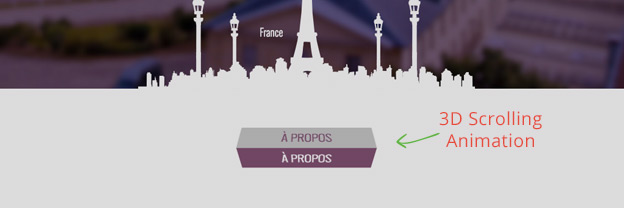
We’ve covered a lot of scrolling animations already, but today we’ll have a look at how to animate an object in 3D.
You might have seen a 3D rotation effect on the Lempens Design Site and you can find a complete deconstruction here.

In this article you’ll learn how to rotate a 3D object on scroll using Skrollr.js.
1. Create Two Elements

To make this rotating effect we will need to create two sides of our object, starting with Side A.
Side A
Create a box .myBox containing a span with text.
<div class="myBox">
    Side A
</div>
This will be hidden on when the page loads and we’ll style it now.
.myBox {
    width: 170px;
    margin: 0 auto;
    padding: 10px 0;
    background-color: #d73f22;
    color: #fff;
    position: relative;
}
Next we’ll add the side which will be visible when the page loads, I will call it Side B.
Side B
This will be a div container inside of our .myBox, also containing the text in a span.
<div class="myBox">
    <div class="myBoxB">
        <span>Side B</span>
    </div>
    SIDE A
</div>
We will style it and position it absolute, which will make it appear on top of our Side A.
.myBoxB {
    width: 170px;
    position: absolute;
    top: 0;
    left: 0;
}
.myBoxB span {
    display: block;
    padding: 10px 0;
    border: 1px #d73f22 solid;
    background-color: #ffffff;
    color: #d73f22;
}
If you refresh your browser now, you’ll just see Side B.
Don’t panic, that’s intentional.
2. CSS 3D Transforms
To turn our HTML into a 3D shape, we will need to add some CSS3 transformations.
First we turn .myBox by -90deg which essentially flips the Side A face down.
.myBox {
    width: 170px;
    margin: 0 auto;
    padding: 10px 0;
    background-color: #d73f22;
    color: #fff;
    position: relative;

    -webkit-transform: rotateX(-90deg);
    transform: rotateX(-90deg);
    -webkit-transform-style: preserve-3d;
    transform-style: preserve-3d;
    -webkit-backface-visibility: hidden;
    backface-visibility: hidden;

}
Then we rotate Side B .myBoxB by -90deg.
.myBoxB {
    width: 170px;
    position: absolute;
    top: 0;
    left: 0;

    -webkit-transform-origin: center top;
    transform-origin: center top;
    -webkit-transform: rotateX(-90deg);
    transform: rotateX(-90deg);

}
The last thing we need to do is to flip our label for Side B or it would be upside down like this.

Adding this CSS to .myBoxB span makes it display the way we want.
.myBoxB span {
    border-color: #d73f22;
    background-color: #ffffff;
    color: #d73f22;

    -webkit-transform: rotateX(-180deg);
    transform: rotateX(-180deg);

}
3. Scrolling Animation With Skrollr
Next, we’ll simply include Skrollr in the project and reference the skrollr.min.js just before the closing body tag.
<script src="js/skrollr.min.js"></script>
        <script type="text/javascript">
            var s = skrollr.init();
        </script>
    </body>
</html>
var s = skrollr.init(); turns Skrollr on and once we include our data-attributes, we can start animating.
Add Skrollr Data-Attributes
To rotate our block from one side to the other, we need to rotate it from -90deg to 0.
We’ll do that by adding these two data-attributes to the .myBox container.
data--20p-bottom="transform: rotateX(-90deg)"
data--50p-bottom="transform: rotateX(0deg)"
We keep rotating it until it hits 20 percent from the bottom of the viewport and then animate it to rotateX(0deg) until it is in the middle of the page.
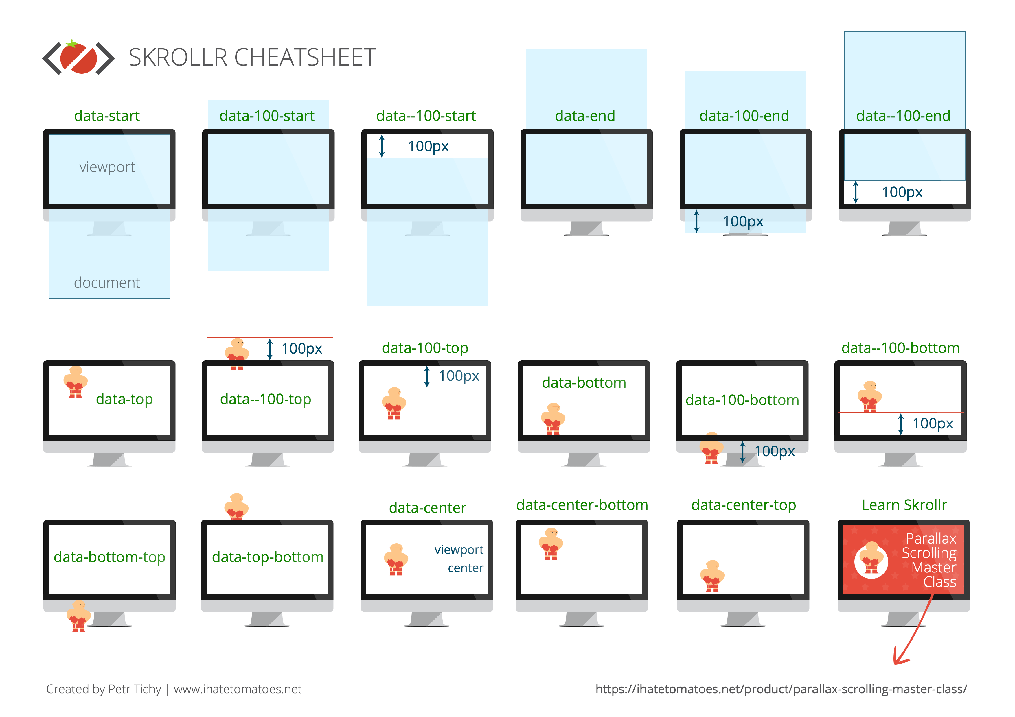
Use this Skrollr Cheatsheet for a reference.
Add A Perspective

Great everything is rotating as we wanted from one side to the other, but adding a perspective to the whole animation will make it look more real and more 3D.
We’ll wrap .myBox into a div.perspective container and apply the following CSS.
.perspective {
    -webkit-perspective: 800px;
    perspective: 800px;
}
This creates a perspective point in space and shapes our transition into a 3D animation.
Conclusion
Have you tried to use Skrollr or other scrolling libraries for a 3D animation effect? What do you think about this effect? Let me know in the comments below.
Until next time, happy coding.
Like What You're Reading?
Sign up to receive my future tutorials and demos straight to your inbox.
No spam, Unsubscribe at any time.


Nice trick for 3D animation . I’ll definitely use this my up coming web project.
Am I blind, or are the actual Skrollr Data-attributes really missing in this tutorial?
Oops, I’ve updated the article with the data attributes, not sure how come they were missing. Thanks for the heads up and sorry for the confusion.
No problem and thanks for the update 😉
Great tutorial. Thanks Petr.
Thanks Tony!