How to create the phone transitions from the Google Calendar landing page?
Let’s explore how Google created this nice animation.
CSS3 Transforms and GreenSock Tweens
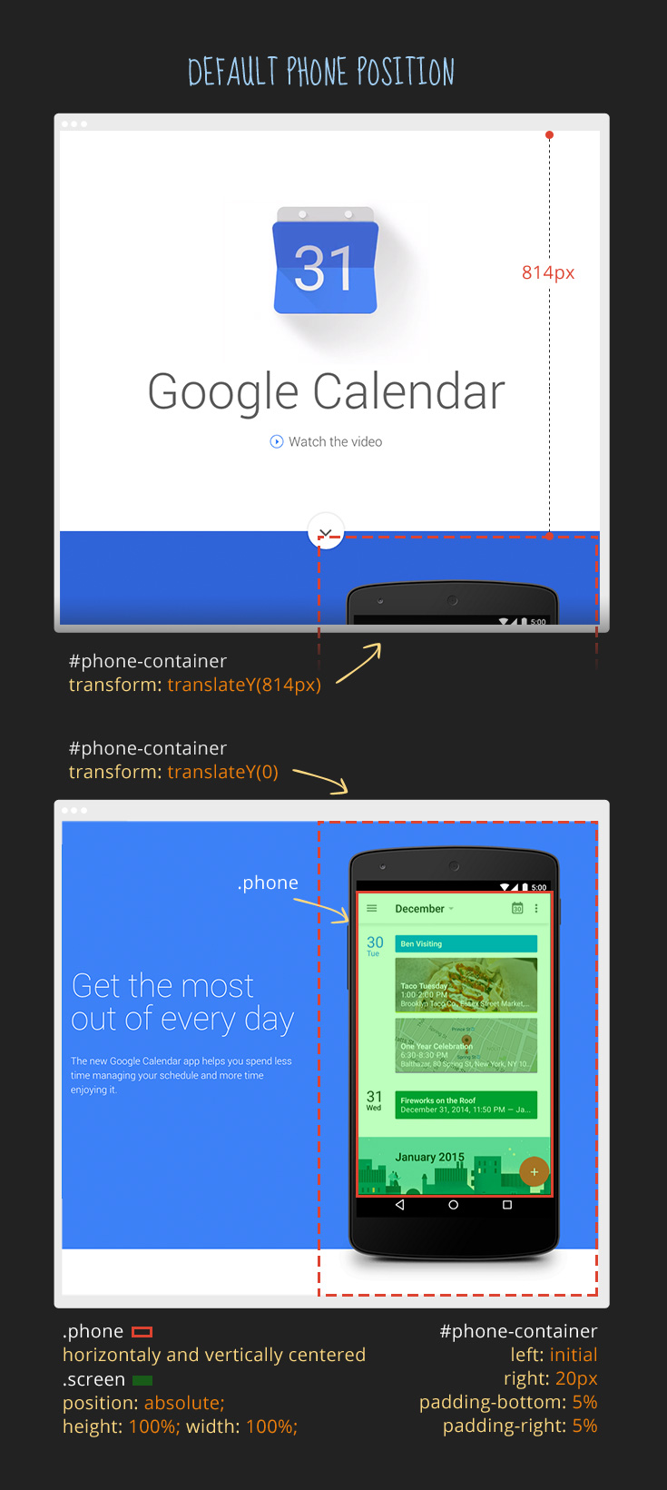
The right 50% of the screen is a container holding all the phone assets.
This container is moved out of the screen on page load and then animated back to the default position defined in the CSS stylesheet.
Explore more details and GreenSock Tweens in the full deconstruction.
Like What You're Reading?
Sign up to receive my future tutorials and demos straight to your inbox.
No spam, Unsubscribe at any time.


