This article is a result of a small experiment we did while working on our new project – ClickFork. The aim was to a get better understanding of the current state of Melbourne’s most popular restaurant websites.
What did we do?
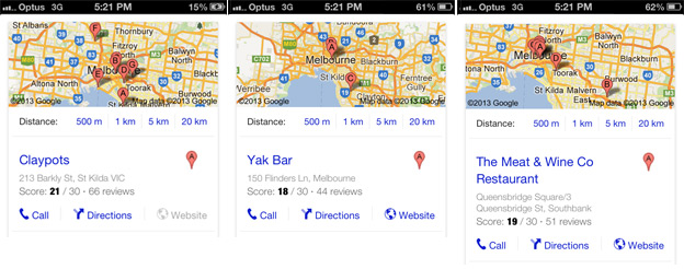
The experiment was quite simple. We searched for random food and restaurant related search queries on our mobile phone. We then picked the first restaurant from the search results and evaluated their website and online presence in general.
Our search queries and results:
- best seafood restaurant melbourne – Claypots
- best pasta in melbourne – Yak Bar
- steaks in melbourne – Steer Bar and Grill
Evaluation of random restaurants websites
Curious about how many restaurants would pass our test, we set the following criteria before we started searching. NOTE: this was purely an experiment for our own purposes and should not be taken as direct critique, we are just stating the facts.
Criteria
- Is the site optimised for mobile devices?
- How easily can you find opening hours and location?
- How easily can you find menu and price range?
- How easily can you book a table?
- Social proof – Reviews and links to social profiles?
Claypots
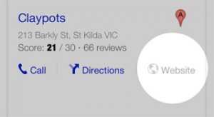
One of my favourite restaurants surprisingly doesn’t have a website at all.
Optimised for mobile
Claypots don’t have their own website, but their Google+ profile is updated and therefore mobile optimised.
Opening hours and location
Both opening hours and location are easily accessible on the Google results page, well done Google.
Menu and price range
We couldn’t find the menu and pricing on the mobile profile, while the desktop version of the Google+ profile has the food menu hidden in the photos section.
Bookings
Google results profile shows ‘Call’ next to a link to directions. Again, well done Google.
Social proof
More than 65 reviews, with the majority of them being very positive. Problem being that there are no other links to social profiles on Facebook, Twitter, or review sites.
Yak Bar
Sometimes you just want the best pasta in your city, and this is what you get.
Optimised for mobile
Yes, the layout is optimised for mobile. We would like to see a more prominent phone number and address on the homepage though.
Opening hours and location
The map section includes an address and Google map, but we couldn’t find opening hours on their mobile site.
Menu and price range
The menu section includes food menu with prices. Formatting could be improved for better readability, but finally a site without a downloadble PDF menu. Well done.
Bookings
The booking section has a number to call, but the text above the phone number says “…or email to arrange a reservation.” Unfortunately we couldn’t find that email address anywhere.
Social proof
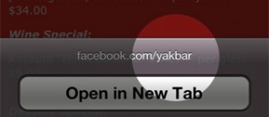
There are links to Facebook and Twitter in the footer, however the Facebook icon links to – Yaumil Akbar’s profile on Facebook instead to YakBars FB profile.
Plenty of likes on Facebook, but we couldn’t find any reviews.
The Meat & Wine Co
Steaks for the meat lovers, and red wine… oh I just want it right now.
Optimised for mobile
No mobile optimised website. Instead you are served with a desktop site on mobile devices. You are also taken to an international website and have to click on Australia > VIC > South Bank if that’s where you would like to go.
Opening hours and location
The address and a link to the location on a Google map is in the footer. After a little bit of zoom & pan we were able to find it, but we still couldn’t find opening hours. After more zooming and panning we tried the ‘contact us’ page, where we finally came across it.
Menu and price range
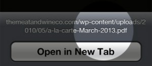
Hmm, “A la Carte” menu on a PDF plate? Yes, there is not a text version of their menu, and the PDF takes a while to download (and we are on a WiFi connection here!). After noticing that the PDF menu was a 3.6MB download, we realised that it would’ve been an even more frustrating experience if it were being downloaded over a 3G connection.
Bookings
It took us a while to find the ‘Make a Booking’ tab in the bottom left, as the color blends with the rest of the page. The booking form slides up and the submit button is cut off. This wouldn’t be the greatest experience for people with larger fingers.
Social proof
There are no reviews on the site, but links to Facebook and Twitter profiles are clearly visible in the sidebar. Their Facebook page has a lot of likes and great content. I really want one of the steaks now.
Conclusion
Whether you want the best seafood platter, pasta, or steak- Melbourne has it all.
We are sure that visiting any of these great restaurants will be an amazing experience.
Without calling a winner, this experiment just confirmed our suspicion that restaurants in Melbourne deserve better websites.
That’s where ClickFork will come to rescue Melbournian’s food lovers. ClickFork will offer simple, beautiful restaurant websites for an affordable monthly subscription.
Let me know what you think is the the most frustrating thing when looking for a restaurant on the go?
Like What You're Reading?
Sign up to receive my future tutorials and demos straight to your inbox.
No spam, Unsubscribe at any time.


