We all know that parallax websites are currently the most talked about topic in web design and development. This trend doesn’t show any signs of slowing down and plenty of great parallax websites are popping up like mushrooms after the rain.
The Be Moved page by Sony certainly stands out from the crowd.
Let’s have a closer look under the hood of this visually engaging site.
Introduction
This and my other website deconstructions are purely based on my own observations. They’re all put together while exploring the source code using the Developer Tools in Google Chrome.
You will not find a complete How to Build a Website like Sony’s “Be Moved” guide here, but it will help you get your head around how similar sites are built and get a sense of direction for your next project.
All the code snippets are simplified for you, for better readability.
Main structure and scrollbar
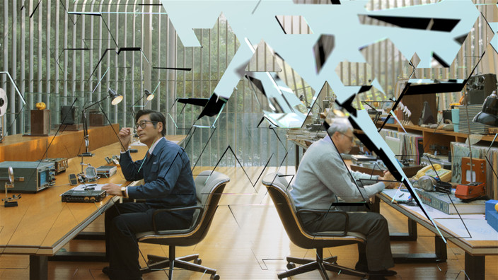
First of all let’s explore the main structure of the page by having a look at the html and css. The first thing I see is a colored scroll bar which tells me that the body will have an overflow:hidden and another container will be scrolled instead.
/* CSS */
body {
    background: white;
    color: #474747;
    font-family: sst_proregular, 'Helvetica Neue', Helvetica, Arial, sans-serif;
    line-height: 1.35;
    height: 100%;
    overflow: hidden;
}
.scrollbar {
    position: absolute;
    z-index: 21;
    top: 0;
    bottom: 0;
    right: 0;
    width: 10px;
    background: rgba(200, 200, 200, 0.3);
    display: none;
    opacity: 0;
    margin-right: -10px;
}
.scrollbar .track {
    position: absolute;
    margin-top: 20px;
    margin-bottom: 20px;
    top: 0;
    bottom: 0;
    left: 0;
    right: 0;
    width: 10px;
}
.scrollbar .thumb {
    position: absolute;
    top: 0;
    display: block;
    width: 10px;
    height: 40px;
    margin: -20px 0;
    background: #81C9DF;
    -webkit-transition: background-color 0.2s linear;
    -moz-transition: background-color 0.2s linear;
    -ms-transition: background-color 0.2s linear;
    -o-transition: background-color 0.2s linear;
    cursor: pointer;
}

.viewport-inner canvas {
    position: absolute;
    left: 0;
    top: 0;
}
<body>
    <div class="wrapper" id="full-content">
        <div class="viewport" id="viewport">
            <div class="viewport-inner" id="content">

                <!-- Articles content for each of the 9 slides -->
                <article id="S01_PRODUCT" class="product-name left" style="display: none;">...</article>
                <article id="S01_POSTER_TITLE" class="headline left" style="display: none;">...</article>
                <article id="S01_POSTER" class="poster left" style="display: none;">...</article>

                <!-- All other slide markup -->

                <article id="S09_POSTER_TITLE" class="headline" style="display: none;">...</article>
                <article id="S09_POSTER" class="poster" style="display: none;">...</article>
                <article id="S09_BEMOVED" class="product-name" style="display: none;">...</article>

                <!-- Canvas where the animation happens -->
                <canvas height="1144" width="1450"></canvas>

            </div>

            <!-- Preloader container -->
            <div class="loader" id="loader" style="display: none;">
                Loading…
            </div>
            <div id="frameLoads"></div>

        </div>

        <!-- Scrollbar container -->
        <div id="chrome">
            <nav id="section-nav">
                <ul><li class="">...</li></ul>
                <button class="scroll-down">▽</button>
            </nav>
            <div class="scrollbar">
                <div class="track">
                    <span class="thumb"></span>
                </div>
            </div>
        </div>

    </div>
</body>
The body has a set height of 100%, overflow: hidden;, and the scroll bar is actually a 10px wide container with 40px tall span.thumb. You can see that this is not the natural scrollbar handle when you resize your browser window vertically. The default scrollbar handle would change its height based on the document length.
span.thumb always stays at 10x40px and changes its background colour as you scroll down the page (nice touch!), to match the colour scheme of the page.
div#section-nav contains the navigation ul.
.viewport-inner contains the content for each of the slides, broken down to product link, title and copy.
canvas is the element where all the magic animation happens. When you remove this element from the html markup you won’t see any background animations.
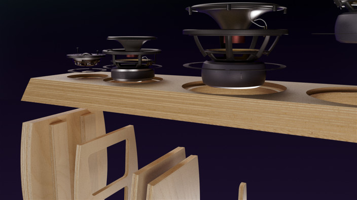
Try it your self: In Google Chrome right-click anywhere on the page and open your Developer Tools, hit command+F or control+F on PC, start typing “canvas” in the search field and the canvas element should be highlighted. Right-click on it and select Delete Node from the context menu. You will get a “naked” Be Moved page. Now when you scroll up and down the page you will see only the text, hotspots, and scroll bar moving.
That means that all the animations happen on the canvas as we’ll find out more in the next section.
How is the animation done

Let’s dig even deeper. We need to look at some JavaScript files. You can find all the JavaScript files used on the page in the Resources tab in Developer Tools. I opened all.min.js and unminified it through jsbeautifier, then opened the source code on a my code editor.
Simply search for canvas or similar terms and you’ll get to a function where the animation is controlled. Even better is to search for frameLoads, which is a div that’s quite specific to this project. canvas could be used in other plugins and libraries and might not lead us to the right piece of code.
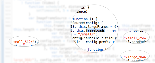
Don’t try to understand the whole function, but what you can see is the 3 sets of images for mobile, tablet, and desktop in the /small_256/, /small_512/, /large_960/ folders. These are 3 folders containing all the assets. There is in total 1306 frames in the whole animation sequence.
ImageToCanvas function is then changing the frame (image) rendered on the canvas element based on the percentage of your scroll offset.
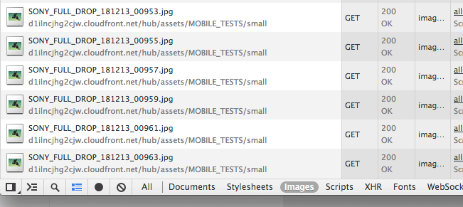
It is that simple, ALL you have to do is to create a stunning video sequence like Sony did, or Apple did on their Mac Pro website, and you can build a similarly amazing website.
For more details about Canvas Image Conversion check out David Walsh’s demo.
Tablet and mobile support
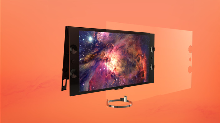
The animation plays quite nicely even on tablets, although the scrolling is a little bit slower and not the natural ‘touch’ scroll. It’s still a very nicely implemented parallax scrolling experience.
The mobile implementation is very simple and only shows one static image per section, plus the text. That is exactly what the users on the go need and is quite often overlooked by other designers who are trying to make parallax scrolling work the same for every device.
Interesting Facts
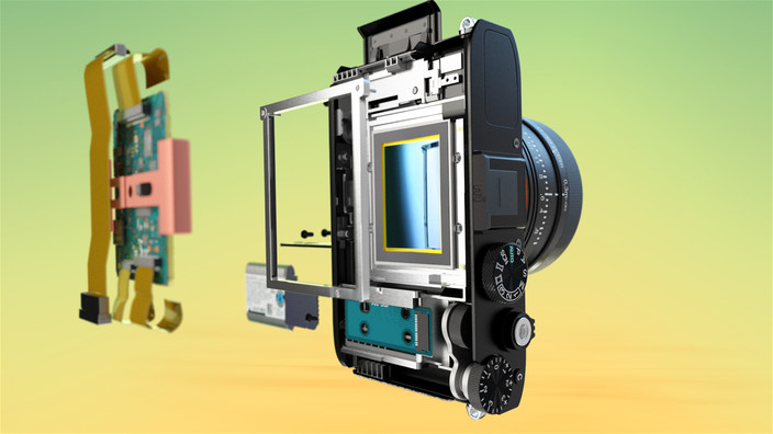
- The animations is created by
1306 frames - If played at
30fps, this would be45sec movie - Large image resolution:
720p - 1280 × 720 16x9aspect ratio- Only
40 framesare preloaded ahead
Conclusion
Well done Sony, you have moved us – or at least me.
As you can see, the “WOW” effect is created by a perfectly animated video sequence exported into jpg assets. Creating a similar effect in Photoshop would be pure madness. Instead, explore how to export your movie from After Effects or iMovie. I might do an experiment here on my blog in the future, stay tuned!
What do you think about the Be Moved page by Sony? Does it move you? Let me know in the comments below.
Like What You're Reading?
Sign up to receive my future tutorials and demos straight to your inbox.
No spam, Unsubscribe at any time.



I think this website stands out more for its slowness than anything… bloated at 4.4Meg 100+ request, slow on most computers…
I used to hate parallax websites because of how bloated they are. Slow load time may equal a higher bounce rate, but when you’ve built a website that’s a masterpiece, it’s going to make up for the bounce rate.
Fair comments about the size Mason and Afred. I agree that creating a masterpiece sometimes requires to go overboard in some way. Thanks for stopping by.
I like the way this is done. And 4.4mb even impresses by how ‘small’ it is actually. If I look at a lot of ‘regular’ sites who come in over 1.5mb or even 2mb.. (Apple’s Mac Pro site is 22mb for comparison).
I do like the way it is built but from a practical view, I think a fullscreen vid would have been nice as well, but then it wouldn’t be interactive..
Nice show how web technology is evolving and pushing the boundaries.
Hey Tom, thanks for the comment and bringing up a great point for discussion.
Would full-screen video have the same impact and also would it get so many people talking about it?
Btw here is the Apple Mac Pro website deconstruction for anyone who missed it.
Greate post! Thank you very much.
You’re welcome Max, thanks for the comment.
You just got a new subscriber. Thank you for this!
Welcome on board Jeesun and thanks for your feedback.
Thank you very much. It’s simply AMAZING!
I foresee all my next project in PARALLAX.
Hi Theresa, thanks for stopping by. Keep your parallax effects subtle and they will surely impress. Good luck.
Awesome work. I was thinking hard about how the animations were working. Thanks again for clarifying this.
I have two question
1. are they loading the image frames in asynchronous mode?
And,
2. Instead of using a linear scrolling, If I make a point-and-click environment that opens scope for multi-direction and more effects, how convenient will it be for users who are used to linear scrolling ( top-bottom or sideways). m sorry my question got too long.
excellent write-up. would you ever see this on an intranet?
Thank You so much for your post its Amazing!!!
Hi,
nice work!
Do you know how I could get the same effect of the first page of the sony page of the elements coming in time delay?
thank you!
I made something similar to this. Check it out If you are interested.
Here is the demo page
http://apps.tweecode.com/custom/scrolltest/
And the repo
https://github.com/Andrinoid/bemoved
can you deconstructed this website?
http://hotdot.pro/
this website looks very cool
i hope you see this
thx
Thanks Syahriel, I will add it to the list. Cheers