
Responsive web development can be quite a challenging and time consuming process. Clients often don’t understand what the complexities are, and why they need to pay more for custom designed responsive websites.
To help you to speed things up here are my 3 tips which will save you time, headaches, and the client some budget.
Comments are your best friends
This tip may surprise you, but it amazes me how many developers don’t use comments in their stylesheet – or they use them very sporadically.
While developing a responsive website you will always end up with one very long stylesheet, or multiple stylesheets dedicated to each breakpoint.
Comments are the easiest way to keep the stylesheet organised.
Lets have a look at a simple example of comments in your stylesheet.
/* --------------------------------------------------
Table of Contents
-----------------------------------------------------
:: =Header

/* Mobile first styles */
/* =Header */
.your-element {
	font-size: 16px;
}
/* END: =Header */

/* Desktop styles */
@media  only screen and (min-width: 768px) {
	/* =Header */
	.your-element {
		font-size: 30px;
	}
	/* END: =Header */
}
Using the above commenting technique lets you easily search for an opening comment and jump to the right part of the stylesheet very quickly.
Be sure to keep the table of contents at the top of the stylesheet always updated. This will be a big time saver for anyone else working on the same project in the future.
I prefer to setup both the table of contents and the opening/closing comments for the main parts of the project at the beginning, and then keep adding sections as the development progresses.
By sticking to commenting your stylesheet, you could benefit from my next tip – splitting the code editor window.
Split windows
My preferred code editor is Coda and it has a great feature which saves me a lot of time while developing responsive websites.
The split window feature lets you divide the editor window into half, while showing a different part of the same file.
This is very handy when you want to adjust styles of the same page element for a different breakpoint.
Lets assume that you have marked your header styles with opening/closing comments. Searching for =Header in the whole file will return 3 results, the first one is in the Table of Contents and the other two are sections for a specific breakpoint.
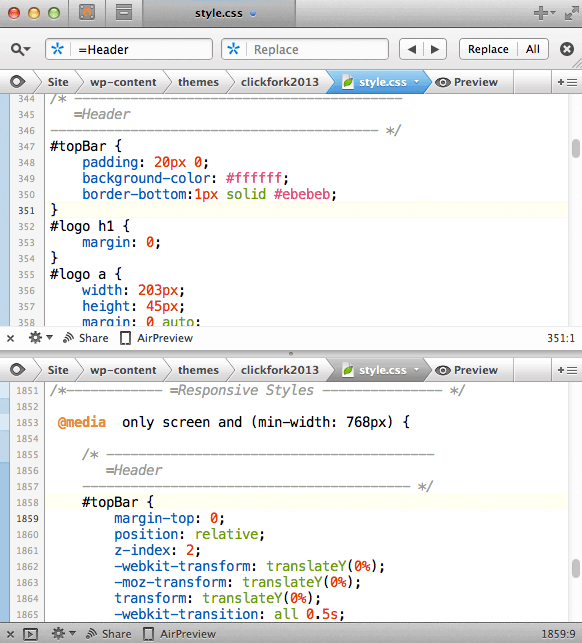
Splitting the window in two will help you quickly see styles applied to the same element for a different media query, and adjust the styles accordingly.
Use a CSS framework
Lets be clear here, CSS frameworks save you time. A lot of time. If you are not using at least the typography and the grid part of any CSS framework such as Bootstrap or Foundation, you are probably wasting a lot of time and money.

I am not saying to include the whole framework if you know it will not be needed in the project, but the grid system itself can save you hours of development.
GRID
Every project needs a grid so why to reinvent the wheel on every project?
If you need to adjust spacing inside the columns you can simply add a container and apply your desired padding.
If you need an elements to break out of the default column width, you can use negative margins.
By keeping the default column widths untouched you will keep the grid system working consistently across all devices and breakpoints.
Typography
Having consistent typography and vertical rhythm is a must for a pixel perfect website. Both Bootstrap and Foundation give you a good starting point for your project.
Simply adjust the font sizes for your own projects at the top of your stylesheet.
Conclusion
These are my 3 simple tips for quick responsive web development. I hope you find some of them useful.
Which tools or processes help you to complete your projects more efficiently? What helps you to save time while developing responsive websites? Let me know in the comments below.
Like What You're Reading?
Sign up to receive my future tutorials and demos straight to your inbox.
No spam, Unsubscribe at any time.
Thanks for sharing this useful tips with online community. Because there are so many IT Companies that provide simple tips for a quicker responsive web development but it is hard to find the perfect one. But Your Idea is really awesome.