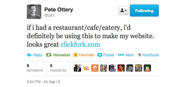
After a few months of long hours and hard work, we are super excited to announce that our project is now released to the wild. Say hello to ClickFork – Beautiful, flexible restaurant websites.
Even though ClickFork is aimed at the restaurant owners and managers, it is full of a design, front-end and back-end goodness.
Why ClickFork?
Similar to the platform itself, the reason behind ClickFork is also very simple.
We are trying to lift the standard of restaurant websites, by providing affordable, user-friendly, and easy to manage websites for every restaurant owner and manager.
Why we think it’s hot
- beautiful design
- clear calls to action
- flexible, mobile-optimised templates
- simplified admin interface
- quick and friendly support
The winner is…
Beautiful design is one thing, but more importantly, potential diners will find it very easy to get to the most important details such as readable menus, clear contact details, location and opening hours.
Over the next few posts, I will be sharing our secrets to creating the most flexible, simple, functional, responsive themes for restaurants.
Check it out now and stay tuned for more info from behind the scenes.
What is your thoughts on an ideal restaurant website? Let me know in the comments below.
Like What You're Reading?
Sign up to receive my future tutorials and demos straight to your inbox.
No spam, Unsubscribe at any time.


