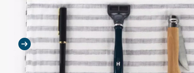
Harry’s website by Gin Lane Media has been awarded site of the day by the prestigious AWWWARDS on the 13th May 2013.
Simple layout, beautiful product photography, and a few interactive elements makes this website stand out and rightly be awarded as a site of the day.
This website deconstruction might be useful for anyone who is wondering how some of the interactive elements were created. It is also a great way to learn new techniques and inspire your coding for the next project.
Now lets have a look at the effects and how they were created.
Slide to reveal image underneath
This is a very cool effect which can be done quite simply with just a few lines of javascript.
HTML
<div class="frame" id="animation_slider">
    <div class="slider plan"></div>
    <div class="slider product" style="height: 358px;"></div>
    <div class="pull" style="top: 348px;">
        <div class="tab"></div>
        <div class="bar"></div>
        <div class="tab"></div>
    </div>
</div>
- Frame is a simple div with a dotted line as a background-image aligned right.
div.planis the drawing image with the lowest z-index and therefore visually appears at the bottom.- On top of the
div.planisdiv.product, with a product image as its background. - Lastly there is the draggable handle which consists of 3 simple elements styled purely with css – 2 circles and a line. This has the highest z-index and therefore always appears on top of everything.
JavaScript
- The effect is actually quite simple, you just need to resize the
div.productbased on the top offset of the handle.
Product hotspots
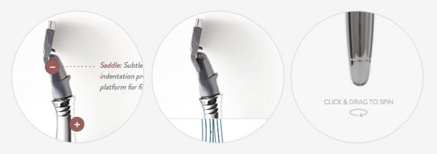
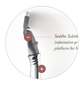
- Rounded product hotspots are divs with css border-radius of 100px, this give a circular impression.
- On hover the background image of
div.dotis changed from plus to minus. - Text appearing on hover has -webkit-transition: opacity .25; applied to it for smooth fade in/out animation.
- Div with the dots connecting text and hotspot is created using the CSS3 :before selector and simple css that looks after the width, height, positioning and background image.
360 Spin of the products
This nice effect which lets you to see the product from every angle was created using Magic 360. What makes it even more interesting is the build in momentum, where the product continues to spin after you’ve stopped rotating it.
Back to top button
The back to top button fades in if the page top offset is greater than 150px. The smooth scroll to the top can be achieved in multiple ways. Here are three examples which you can try on your next project:
- Animated Scroll to Top
- How To Create An Animated Scroll To Top Button With jQuery
- Smooth Page Scroll to Top with jQuery
Product video with custom play button
 A nice way to add interactivity to your website is HTML5 video. Harry’s product video plays automatically when you scroll to it. This is achieved with extra JavaScript:
See code example and related stackoverflow article – Play HTML5 Video when scrolled to.
Conclusion
Every small or big project consists of a few simple ideas creatively put together. Having a designer working closely with a front-end web developer is the key for creating stunning websites.
I hope that this deconstruction has inspired you for your next project.
Let me know if you would like to deconstruct another cool looking site of the day. And who knows one day your website might also be awarded “Site of the Day” on Awwwards.com. Good luck.
Like What You're Reading?
Sign up to receive my future tutorials and demos straight to your inbox.
No spam, Unsubscribe at any time.


Keep them coming! Simple little interactions make a world of difference.
Thanks for reading Milos. I will certainly keep adding similar deconstructions. Stay tuned.
It seems to be that Harry’s website updated. I didn’t see Slide to reveal image underneath effect in the live site. Is it updated? I think it would be great if you add a short video just show that effect or part of website that deconstructed or gif animation of that effect. So that, if in future that site is updated reader have something to see the preview of that deconstructed effect on blog.