How to create animated page transitions as seen on the Dropbox Guide?
Have a look under the hood of this creative page transitions from Dropbox.
CSS3 Transforms
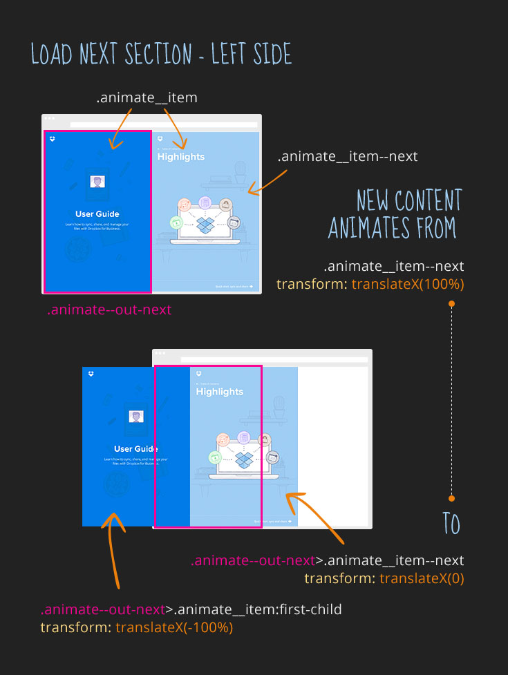
The page is divided into two halves and when you click on the next or previous navigation link, the new content slides in from a side.
The interesting part is that each side of the screen animates on its own.
The new content is preloaded and CSS3 transforms are then animating two containers to the right position.
Explore this creative effect in more detail in the full deconstruction.
Conclusion
Pretty cool, right? Have you experimented with non traditional page transitions and layouts on your own projects?
Let me know in the comments below.
Like What You're Reading?
Sign up to receive my future tutorials and demos straight to your inbox.
No spam, Unsubscribe at any time.


