You may have seen the Discovershadow.com site, where the initial header image zooms in and fades out once you scroll down the page.
Pretty slick effect would you say, huh? Today I’m going to show you how you can accomplish a similar effect on your next project.
Note: Currently the demo is not responsive or mobile-optimised.
1. Include Skrollr.js
Include Skrollr.js preferably before the closing tag. This plugin will handle all the animations for you.
<script src="//ajax.googleapis.com/ajax/libs/jquery/1.9.1/jquery.min.js"></script>
<script>window.jQuery || document.write('<script src="js/vendor/jquery-1.9.1.min.js"><\/script>')</script>
<script src="js/skrollr.js"></script>
<script src="js/_main.js"></script>
2. HTML and CSS
<body>
    <main>
        <section id="slide-1" class="homeSlide">
            <div class="bcg"></div>
               <div class="plaxEl">
                  <h2>This is your title</h2>
                  <p>This is your slide description.</p>
               </div>
        </section>
    </main>
</body>
div.bcg is a container which will hold our background image for each of the slides. I am showing just one section here, but the other two have the same html markup, just different content and ID.
.bcg {
background-position: center center;
background-repeat: no-repeat;
background-size: cover;
height: 100%;
width: 100%;
position: fixed;
top: 0;
left: 0;
}
/* Slide 1 */
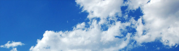
.bcg {background-image:url('../img/clouds.jpg');}
/* Slide 2 */
#slide-2 .bcg {background-image:url('../img/img_road.jpg');}
#slide-2 h2,
#slide-3 h2 {color: #ffffff;}
#slide-3 p,
#slide-3 p {color: #b2b2b2;}
/* Slide 3 */
#slide-3 .bcg {background-image:url('../img/img_earth2.jpg');}
Our background image div.bcg is always fixed to the top left of the browser and covering 100% of width and height of the .homeSlide.
3. Initiate Skrollr
var s = skrollr.init();
Initiate the skrollr in your _main.js file or another place where you have the rest of your page functionality. Refer to Skrollr.js documentation for more details.
4. Skrollr.js settings
And now to the fun part of the tutorial. Let’s apply our data attributes to make the background image resize and fade out on page scroll.
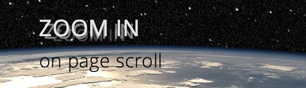
<!-- Slide 1 - Cloud image -->
<section id="slide-1" class="homeSlide">
       <div class="bcg" data-top="opacity: 1; width: 100%; height: 100%; top: 0%; left: 0%;" data-center="opacity: 0; width: 156%; height: 156%; top: -28%; left: -28%;" data-anchor-target="#slide-1"></div>
       <div class="plaxEl" data-0p-top="opacity: 0" data-center="opacity: 1;" data-100p-top="opacity: 1; position: fixed; top: 206px; width: 100%; left: 0;" data--25p-bottom="opacity: 0;" data--20p-bottom="opacity: 1;" data-anchor-target="#slide-1">
              <h2>This is your title</h2>
              <p>This is your slide description.</p>
       </div>
</section>
On the first slide we are animating from opacity: 1; width: 100%; height: 100%; top: 0%; left: 0%; to opacity: 0; width: 156%; height: 156%; top: -28%; left: -28%;. This gives the impression that we are zooming into the image while scrolling. You can play with these settings to achieve different results, but having the top and left offset (-28) half of size increase (56) works the best in my examples.
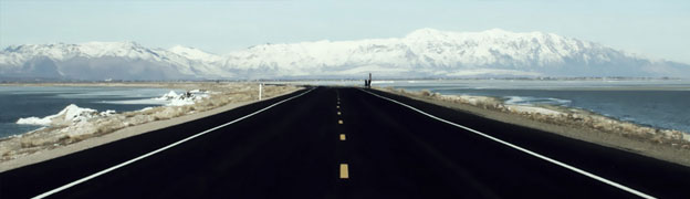
<!-- Slide 2 - Road image -->
<section id="slide-2" class="homeSlide" data-bottom="opacity: 0;" data--10p-bottom="opacity: 1;" data-anchor-target="#slide-1">
       <div class="bcg" data-top="opacity: 1; width: 100%; height: 100%; top: 0%; left: 0%;" data-40p-bottom="opacity: 0; width: 196%; height: 196%; top: -48%; left: -48%;" data-anchor-target="#slide-2"></div>
       <div class="plaxEl" data-top="opacity: 0; position: fixed; top: 206px; width: 100%; left: 0;" data-center="opacity: 1;" data-10p-bottom="opacity: 1;" data-bottom="opacity: 0;" data-anchor-target="#slide-2">
              <h2>This is your title</h2>
              <p>This is your slide description.</p>
       </div>
</section>
We are animating the second slide from opacity: 0 to opacity: 1. This happens when the bottom of #slide-1 is 10% above the bottom of the viewport. For a more visual picture please refer to this infographic which explains the relationship between the anchor and the element.
Trust me – it took me a while to get the demo perfect, so don’t be afraid to experiment to learn exactly how it works.
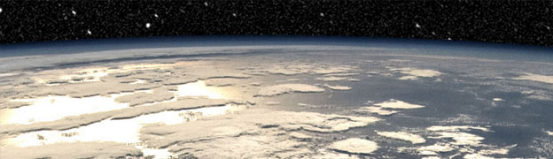
<!-- Slide 3 - Earth image -->
<section id="slide-3" class="homeSlide" data-bottom-top="opacity: 0;" data-center="opacity: 1;" data-top="opacity: 1;" data-anchor-target="#slide-3">
       <div class="bcg" data-top="opacity: 1; width: 120%; height: 120%; top: -10%; left: -10%;" data-center="opacity: 1; width: 110%; height: 110%; top: -5%; left: -5%;" data-bottom="opacity: 0; width: 100%; height: 100%; top: 0%; left: 0%;" data-anchor-target="#slide-3"></div>
       <div class="plaxEl" data-top="opacity: 0; position: fixed; top: 206px; width: 100%; left: 0;" data-center="opacity: 0;" data-bottom="opacity: 1;" data-anchor-target="#slide-3">
              <h2>This is your title</h2>
              <p>This is your slide description.</p>
       </div>
</section>
On the third slide I wanted to create the opposite effect and zoom out of an image while you scroll. A photo of the earth from space works great for this kind of effect.
We are actually using 3 “keyframes” – data-top, data-center and data-bottom. When the top of #slide-3 is at the top of the viewport we want the earth to be fully visible and slightly scaled up, these settings are set in data-top="opacity: 1; width: 120%; height: 120%; top: -10%; left: -10%;".
In the center of the slide we still want the earth to be fully visible, but slightly scaled down. This is set in data-center="opacity: 1; width: 110%; height: 110%; top: -5%; left: -5%;". We need to include the same attributes in the data-center, but half way between the data-top and data-bottom values (eg: 120% becomes 110%).
If we don’t include the same attributes, this would confuse skrollr and the scaling animation wouldn’t continue past the center point.
data-bottom has the settings for the final part of the animation. It fades the whole background image out, while still scaling it down to 100% of it’s original size.
Finally, we are fading in div.plaxEl containing the title and text when the #slide-3 center is in the center of the viewport, this creates a nice crossfade effect.
Conclusion
There you have it! A quite simple, but effective visual which can bring a normally boring page to life. What do you think about using similar effects on your projects? Leave a comment below or send your questions to @ihatetomatoes.

Like What You're Reading?
Sign up to receive my future tutorials and demos straight to your inbox.
No spam, Unsubscribe at any time.
How to download files when subscribed??? Am I missing something obvious?
Hey Mirko, just enter the same email as when signing up and you’ll get these demo files. Let me know how you go.
Very nice effect, but I don’t like that it is dependant on other jQuery code and plugins. Namely the viewport plugin. Skrollr is vanilla JS, it would be nice if this effect is pulled without any dependancies in the tutorial.
This way someone who just wants the effect for his project must go through a lot of trial and error to make it work. For example I can say that I know my way around code, but I am having trouble recreating the effect without the viewport plugin code in the main js file.
Really great tutorials, but please make them a little less dependant, so that they can be easily ported to someone else’s code :))
Thanks Mirko for the feedback and for stopping by. I get your point and we’ll try to make my future tutorials less dependant.
Hi,
I signed up for your email list already and went through the steps to download these files but I didn’t receive an email link. Please help me. Thanks!
Hi Michael, my email provider had some issues. I have added you manually and you should have received the confirmation email. Please confirm. Cheers
Thanks, I’m in! Now for the big question… Do you know how I can release the content portion of the transition and allow that to be scrollable and not fixed?
I took the example and reduced it to a single slide and added long blocks of content, but it doesn’t scroll. Any feedback here would be awesome. 🙂
can i use this without the fade and a bigger zoom out effect i apologize up front i’m kind of new to jquery’s this is a picture of the motion i want to get
thanks
http://imgur.com/1waAS4B
Hi Olivier, yes you should be able to create a similar effect as on the screenshot, it might be a little bit more advanced though. Here is a deconstruction of the Apple iMac with Retina that has a similar effect, hope that helps.
Hi,
I m trying to remove white BG-color when scrolling but it’s not working please help me
Hey! great tutorial, but I have a question: how can I make a responsive parallax because when I see it on my mobile, only shows a part of the image and no the whole picture. Thanks!
Hi Cesar, I recommend to turn animations off for mobile. Here is a tutorial on how to do it.
How might I go about adding another section? I’ve tried recreating some of the properties of section two (with a different background image) and putting them before section three but it doesn’t seem to work. Thanks!
Which Browsers have a toggle to switch off zoom on scroll ?
This seems to be another example of an effect being applied – “because we’ve found a new toy – we think it’s cool – and we’re going to force it on you too”.
For those of us visiting a website…..
…. probably already top-heavy with unnecessary, or oversized photos – forcing us to scroll past to the actual content we are there to read…..
….The last thing we want is distraction from reading that content by an unwanted animation.
And even if we DO want to examine a photo – it’s harder to focus when it’s moving.
Please let the user control the zoom.
(Do web-designers ever ask users what they prefer ??)